for DC Advanced UX Team.Vivi · Yohan · Libby · Lim Jisu · Katey · Anna
Back Issue
Motion
Illo: one shape per idea, then it moves
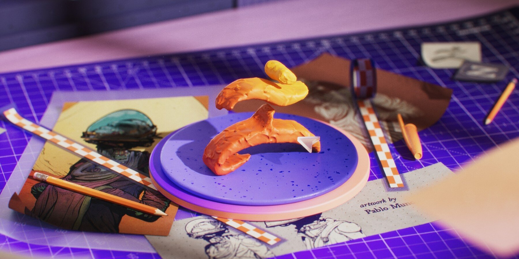
Illo's films for Everpure on Bloomberg TV explain a data platform with four shapes: a monolith for legacy infrastructure, a flat plane for the unified platform, gradients for AI, and small rectangles for data. A chart is the same kit. The monolith becomes a column, rectangles travel in groups, and each one wears a label, from a password to a location. Gradients start as video inside Cavalry. The apparent 3D is composited in After Effects. Ilenia Notarangelo and Arianna Cristiano directed.
일로가 블룸버그 TV에서 에버퓨어를 위해 만든 필름은 데이터 플랫폼을 도형 네 개로 설명한다. 모놀리스는 옛 인프라, 평면은 통합 플랫폼, 그라데이션은 AI, 작은 사각형은 데이터다. 차트도 같은 부품이다. 모놀리스는 기둥이 되고, 사각형은 무리지어 이동하며, 각각 비밀번호에서 위치까지 라벨을 단다. 그라데이션은 캐벌리 안에서 영상으로 시작한다. 입체처럼 보이는 부분은 애프터 이펙트 합성이다. 일레니아 노타란젤로와 아리안나 크리스티아노가 디렉션했다.
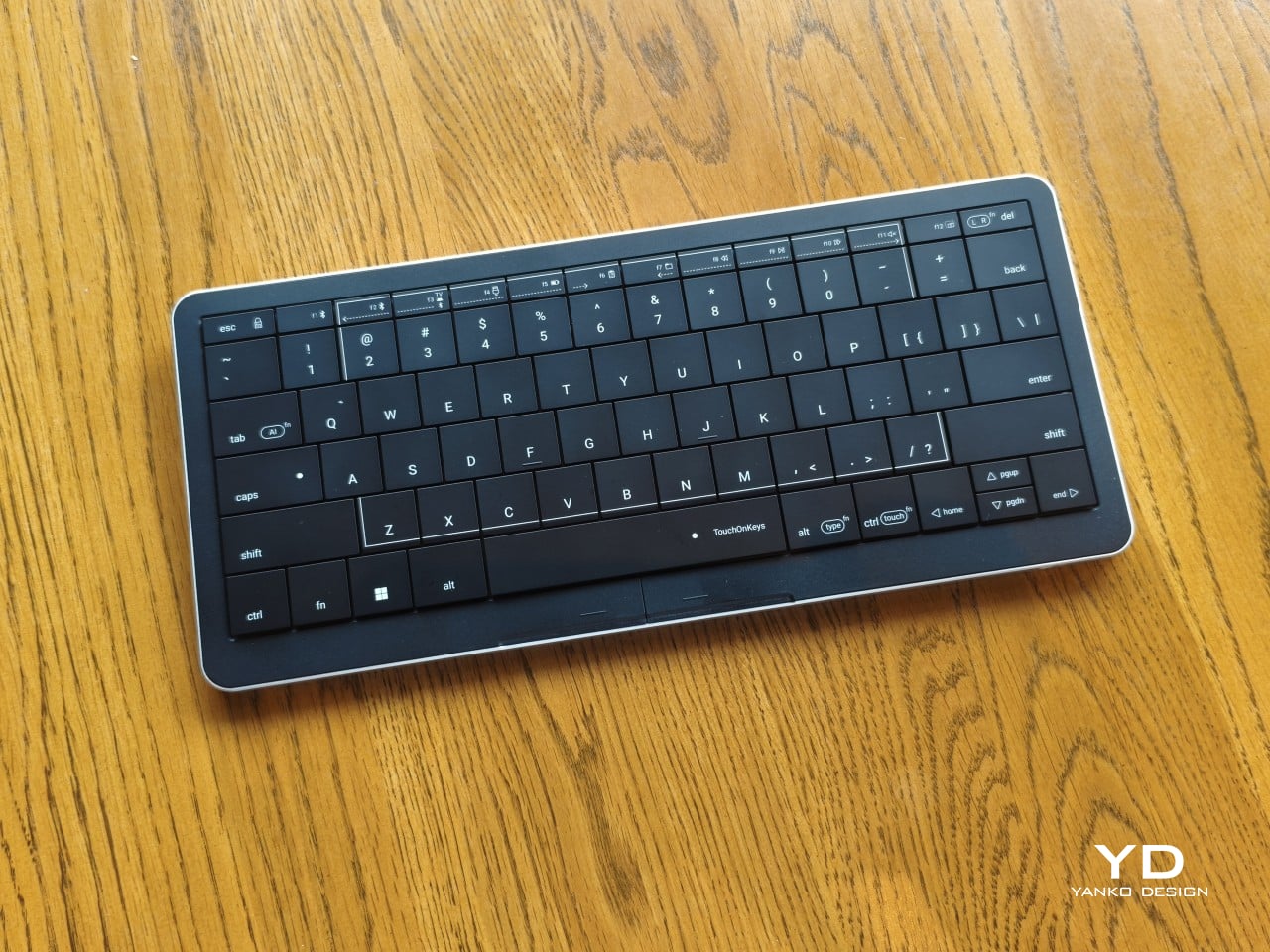
The Clevetura S, also called the CLVX S, turns a 78-key board into the trackpad. Keycaps sit almost tiled, 12.4 mm thick, so a finger can slide across letters without catching an edge. A white light trail follows the swipe. Two buttons under the spacebar are left and right click, and a tap on a key clicks without typing it. After 10,000 characters, Adaptive Intelligence picks a sensitivity so resting fingers do not fire gestures. It weighs 403 g and costs $199.
클레베투라 S, 다른 이름 CLVX S는 78키 키보드를 트랙패드로 쓴다. 키캡은 거의 타일처럼 붙고 두께는 12.4mm라, 손가락이 글자 위를 미끄러져도 가장자리에 걸리지 않는다. 흰색 빛 궤적이 스와이프를 따라간다. 스페이스 아래 버튼 둘이 좌우 클릭이고, 키를 가볍게 두드리면 문자가 아니라 클릭이다. 1만 자를 치면 어댑티브 인텔리전스가 감도를 골라, 홈 로우에 올린 손가락이 제스처를 내지 않게 한다. 무게 403g, 199달러다.
Krea 3 is an editing model. It changes materials, lighting, setting, or text and holds the rest of the picture, working from up to six reference images at once. A 2K edit is listed at under eight seconds and $0.06 through the API. In the same test, Nano Banana Pro took 30 seconds at 15 cents, and GPT Image 2.5 took 80 seconds at 22 cents. Up to four style references set the look without copying the sources. A box already limits an edit to one region. Modes run from real time to maximum quality.
크레아 3는 편집 모델이다. 재질, 조명, 장소, 글자를 바꾸고 나머지 화면은 유지하며, 참고 이미지를 한 번에 최대 여섯 장 받는다. API에서 2K 편집은 8초 미만, 0.06달러로 적혀 있다. 같은 테스트에서 나노 바나나 프로는 30초에 15센트, GPT 이미지 2.5는 80초에 22센트였다. 스타일 참고는 최대 네 장으로 룩을 정하되 원본을 베끼지는 않는다. 상자로 한 영역만 고칠 수 있다. 모드는 실시간에서 최고 품질까지다.
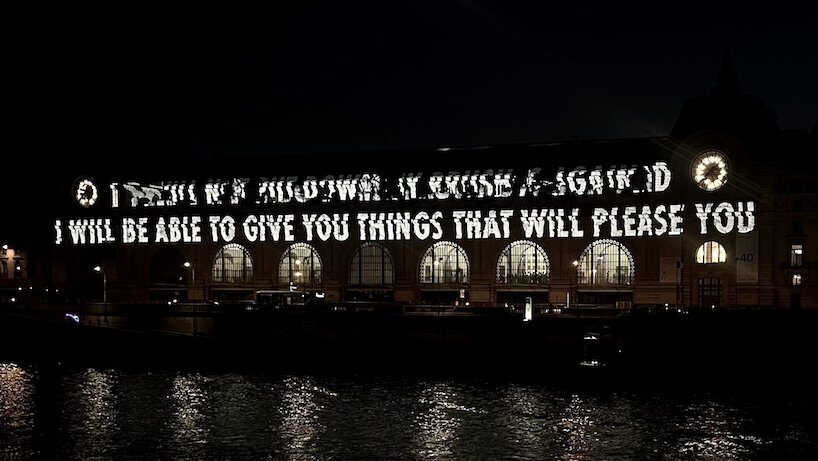
Jenny Holzer's J'ai Vu opens at the Musée d'Orsay on 20 October and runs to 21 February 2027. Outside, ÉCLAIRÉ projects about 250 excerpts by 34 authors, including van Gogh, Cézanne, Flaubert, and Zola, across the Seine facade from 18 to 22 October, 7 pm to 11 pm. Inside, an LED sign in blue, green, and red runs through four galleries. Nineteen stone works, 17 benches and two columns, carry engraved texts from 1848 to 1914. In all, more than 750 texts from 73 authors.
제니 홀저의 제이 뷔가 10월 20일 오르세 미술관에서 열려 2027년 2월 21일까지 간다. 바깥의 에클레레는 10월 18일부터 22일까지 저녁 7시에서 11시, 작가 34명의 발췌 약 250개를 센 강 쪽 파사드에 비춘다. 반 고흐, 세잔, 플로베르, 졸라가 들어 있다. 안에서는 파랑·초록·빨강 LED가 네 개 전시실을 지난다. 석조 19점, 벤치 17개와 기둥 두 개에는 1848년에서 1914년의 글이 새겨진다. 텍스트는 73명에게서 온 750편 이상이다.
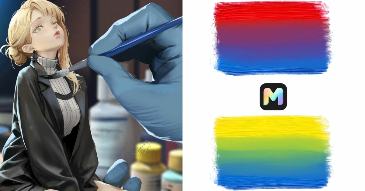
Cubebrush's Moko, still in beta, paints and edits in one app. Photoshop ABR brushes and Clip Studio SUT brushes import and stay almost unchanged. Choose a brush and a color and the stroke previews on the canvas before it is committed. The Natural Paint engine tracks paint on individual bristles: a brush picks color up, carries it, lays it down, and runs dry. Palette knives push the raised paint. Mixing runs locally on the GPU. Marc Brunet's team plans Windows and Mac for late November or early December 2026.
큐브브러시의 모코는 베타다. 그림과 보정을 한 앱에서 한다. 포토샵 ABR과 클립 스튜디오 SUT 브러시를 가져오면 거의 그대로 남는다. 브러시와 색을 고르면 획이 확정되기 전에 캔버스에서 미리 보인다. 내추럴 페인트는 개별 털의 물감을 추적한다. 브러시가 색을 묻히고, 옮기고, 내려놓고, 말라 간다. 팔레트 나이프는 두꺼운 물감을 민다. 혼합은 로컬 GPU에서 돈다. 2026년 11월 말이나 12월 초 윈도우와 맥을 계획한다.
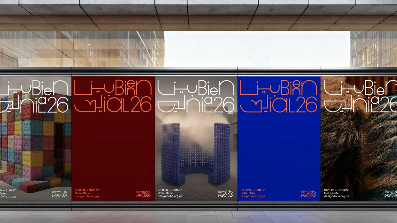
Pentagram partner Samar Maakaroun's identity for Design Doha Biennial 2026 sets Arabic and Latin in one thin stroke, so neither script sits above the other. Letterforms stretch like network lines and connect elements, then expand or contract to the format. An outsized 26 loops around a photograph. Colors are travertine beige, deep maroon, vivid orange, and the previous Design Doha blue. Arab Design Now switches to heavy geometric shapes that lock into letters. The biennial runs 5 November to 31 January.
펜타그램 파트너 사마르 마카룬이 2026 디자인 도하 비엔날레에 만든 아이덴티티는 아랍어와 라틴 문자를 같은 가는 선으로, 나란히 그린다. 어느 문자도 위에 앉지 않는다. 글자는 네트워크 선처럼 늘어나 요소를 잇고, 포맷에 맞춰 늘거나 줄어든다. 큰 26이 사진을 감싼다. 색은 트래버틴 베이지, 짙은 마룬, 선명한 오렌지, 그리고 이전 디자인 도하의 파랑이다. 아랍 디자인 나우는 굵은 기하 도형이 글자로 맞물린다. 비엔날레는 11월 5일부터 1월 31일까지다.
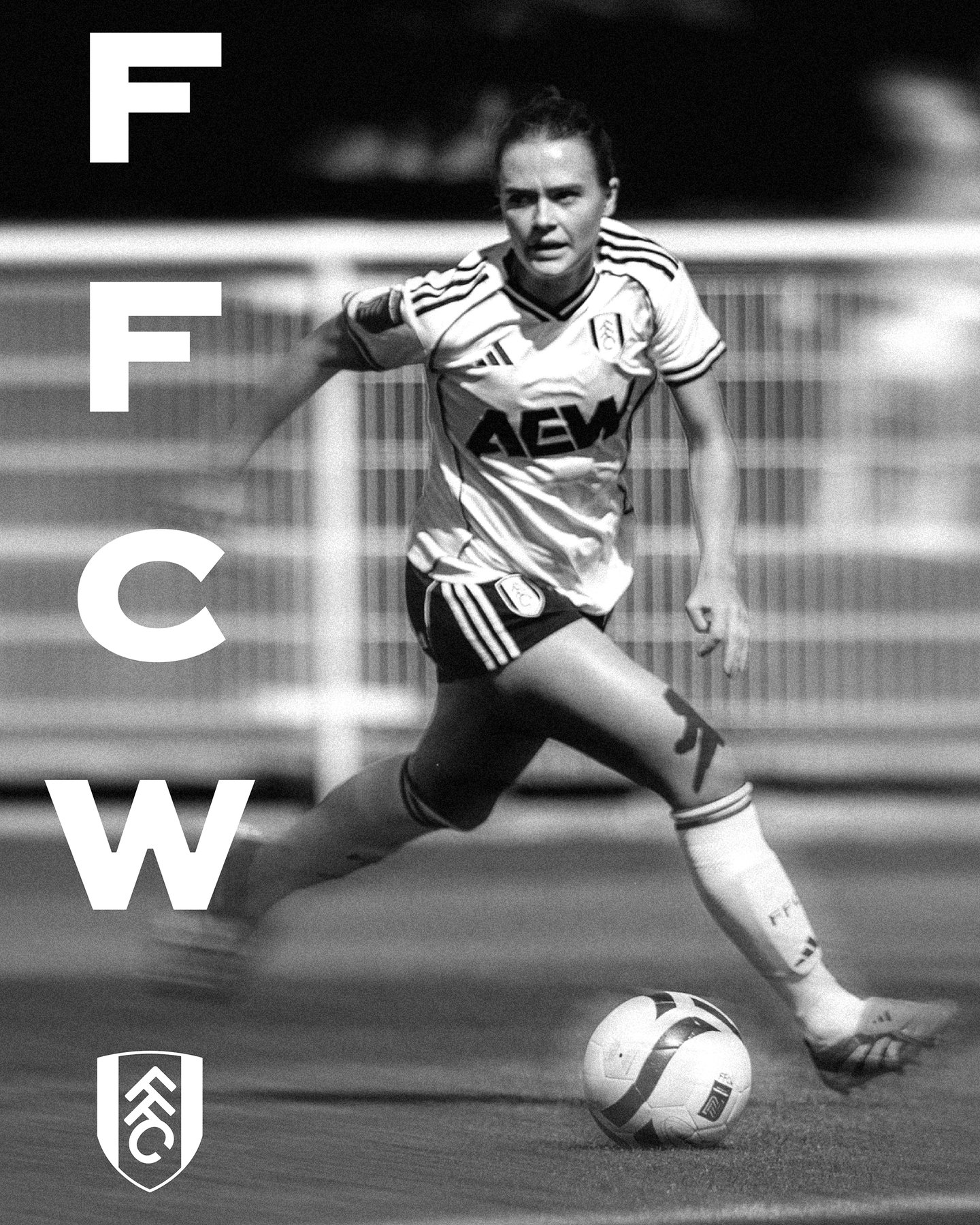
Music and F37 Foundry built Fulham's new type, FFC Original, from hand-rendered lettering already painted inside Craven Cottage, the oldest football stadium in London. Dave Simpson, the agency's executive creative director, treats that lettering as the identity, not a heritage plate beside a new one. The face now runs on matchday graphics, campaigns, retail, and moving image. The 2026/27 away-kit film uses the same type with a 1990s tone. The club is heading toward 150 years.
뮤직과 F37 파운드리가 풀럼의 새 서체 FFC 오리지널을, 런던에서 가장 오래된 축구장 크레이븐 코티지 안에 이미 손으로 그려진 글자에서 만들었다. 에이전시의 총괄 크리에이티브 디렉터 데이브 심슨은 그 글자를 새 아이덴티티 옆의 헤리티지 명판이 아니라 아이덴티티 자체로 다룬다. 서체는 경기일 그래픽, 캠페인, 리테일, 무빙 이미지에 올라간다. 2026/27 원정 키트 필름은 같은 서체를 1990년대 톤으로 쓴다. 구단은 150년을 향해 간다.
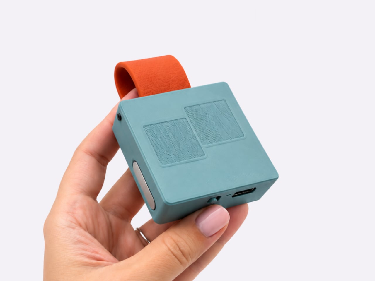
MindRove's TypAir is a prototype Bluetooth keyboard that straps to a pocket. There are no lettered keys. A browser guide maps A to a tap in the bottom-left corner, and the rest of the alphabet is other finger gestures. Custom gestures can stand in for symbols, shortcuts, and repeated commands. The module attaches magnetically and can be recolored with the strap. Android and Windows are listed; iOS and macOS are still in progress. One charge is rated above six hours.
마인드로브의 타이프에어는 주머니에 묶는 블루투스 키보드 프로토타입이다. 글자가 적힌 키는 없다. 브라우저 가이드는 왼쪽 아래를 한 번 두드리는 동작을 A로 정하고, 나머지 알파벳은 다른 손가락 제스처다. 맞춤 제스처는 기호, 단축키, 반복 명령을 대신할 수 있다. 모듈은 자석으로 붙고, 스트랩과 색을 바꿀 수 있다. 안드로이드와 윈도우가 적혀 있고, iOS와 macOS는 아직 진행 중이다. 한 번 충전은 6시간 이상으로 표기된다.
Casey Gu's film for Maxon One turns a modular honeycomb logo into motion across ten tools: Maxon One, Cinema 4D, Red Giant, ZBrush, Redshift, Universe, Capsules, Cinebench, Cineware, and Moves. Shared geometry keeps the suite one family. Timing and crop change with the tool, so a sculpting mark and a renderer do not move the same way. Leo Hageman, director of brand and creative, led the identity. Gu designed, animated, and edited the film.
케이시 구의 맥슨 원 필름은 모듈형 벌집 로고를 열 개 도구의 움직임으로 푼다. 맥슨 원, 시네마 4D, 레드 자이언트, 지브러시, 레드시프트, 유니버스, 캡슐, 시네벤치, 시네웨어, 무브스다. 공유된 기하가 스위트를 한 가족으로 붙든다. 타이밍과 크롭은 도구마다 달라서, 조각 자국과 렌더러가 같은 방식으로 움직이지 않는다. 브랜드·크리에이티브 디렉터 레오 하게만이 아이덴티티를 이끌었고, 구가 디자인, 애니메이션, 편집을 맡았다.
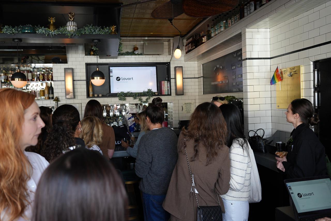
Lovart 2.0 adds Arti, a design agent whose memory has four groups: who you are, how you like to work, the colors you prefer, and the assets you reuse. Every entry can be edited or deleted. Design delegation takes a whole brief, once or on a schedule, and drops the result on a canvas. One showcase job is 42 SKUs in four sizes, 168 images, after a four-SKU test. Design Review flagged a single oil-paint frame inside a storyboard that was supposed to stay hand-drawn. A workflow used three times becomes a skill.
러바트 2.0은 디자인 에이전트 아르티를 더한다. 기억은 네 묶음이다. 누구인지, 일하는 방식, 선호하는 색, 반복해서 쓰는 에셋. 항목마다 고치거나 지울 수 있다. 디자인 위임은 브리프 전체를 한 번 또는 일정으로 받고, 결과를 캔버스에 놓는다. 예시 하나는 SKU 42개, 사이즈 네 개, 이미지 168장이고, 먼저 SKU 네 개로 시험한다. 디자인 리뷰는 손그림이어야 할 스토리보드에서 유화 프레임 하나를 집어냈다. 세 번 쓴 흐름은 스킬이 된다.
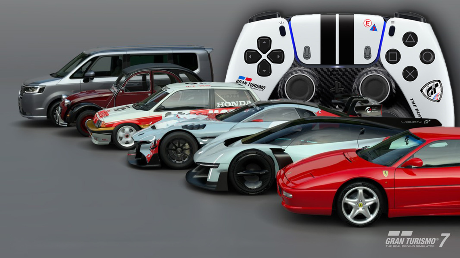
Polyphony's Gran Turismo limited controller is white, with racing stripes, a textured front plate, and a carbon-fiber-style finish. Preorders open 22 October and it ships 10 December, at $84.99 in the US. Update 1.72, out 15 October, also opens Car Concierge: request a model, a color, and a condition, with up to four searches at once if the collector level allows. The same update adds Sportsland SUGO, 2.23 miles and 13 corners, plus six cars including a Ferrari F355 and a Citroën 2CV Charleston.
폴리포니의 그란 투리스모 한정 컨트롤러는 흰색에 레이싱 스트라이프, 텍스처 앞판, 카본풍 마감이다. 예약은 10월 22일, 출하는 12월 10일, 미국 84.99달러다. 10월 15일 업데이트 1.72는 카 컨시어지를 연다. 모델, 색, 상태를 지정하고, 컬렉터 레벨이 되면 검색을 한 번에 네 개까지 돌린다. 같은 업데이트에 스포츠랜드 스고, 2.23마일 13코너와 차 여섯 대가 있다. 페라리 F355와 시트로엥 2CV 찰스턴이 포함된다.
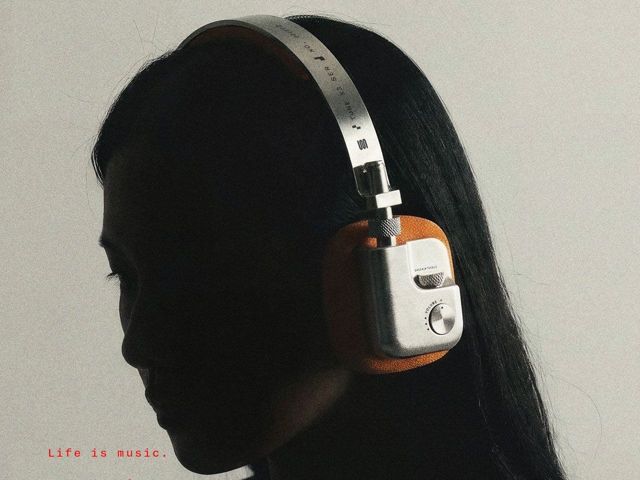
Pressec Design's TUNE X3 is a headphone concept in a fictional family with the CINE X3. Brushed aluminium, orange textile pads, and exposed fasteners read as studio gear. Knurled dials and tactile switches set volume, treble, and active noise cancellation, so each adjustment is found by touch instead of a tap on a smooth shell. A Vizcom reference pass keeps the family related without copying one shape onto the next. There is no price and no ship date.
프레세크 디자인의 튠 X3는 CINE X3와 한 가상 제품군에 속한 헤드폰 콘셉트다. 브러시드 알루미늄, 주황 직물 패드, 드러난 체결부가 스튜디오 장비처럼 읽힌다. 널링 다이얼과 촉각 스위치가 볼륨, 고음, 액티브 노이즈 캔슬링을 맡아서, 매끈한 껍질을 두드리는 대신 손으로 더듬어 찾는다. 비즈컴 레퍼런스 패스는 한 형태를 다음 제품에 복사하지 않고도 가족을 이어 준다. 가격도 출하일도 없다.
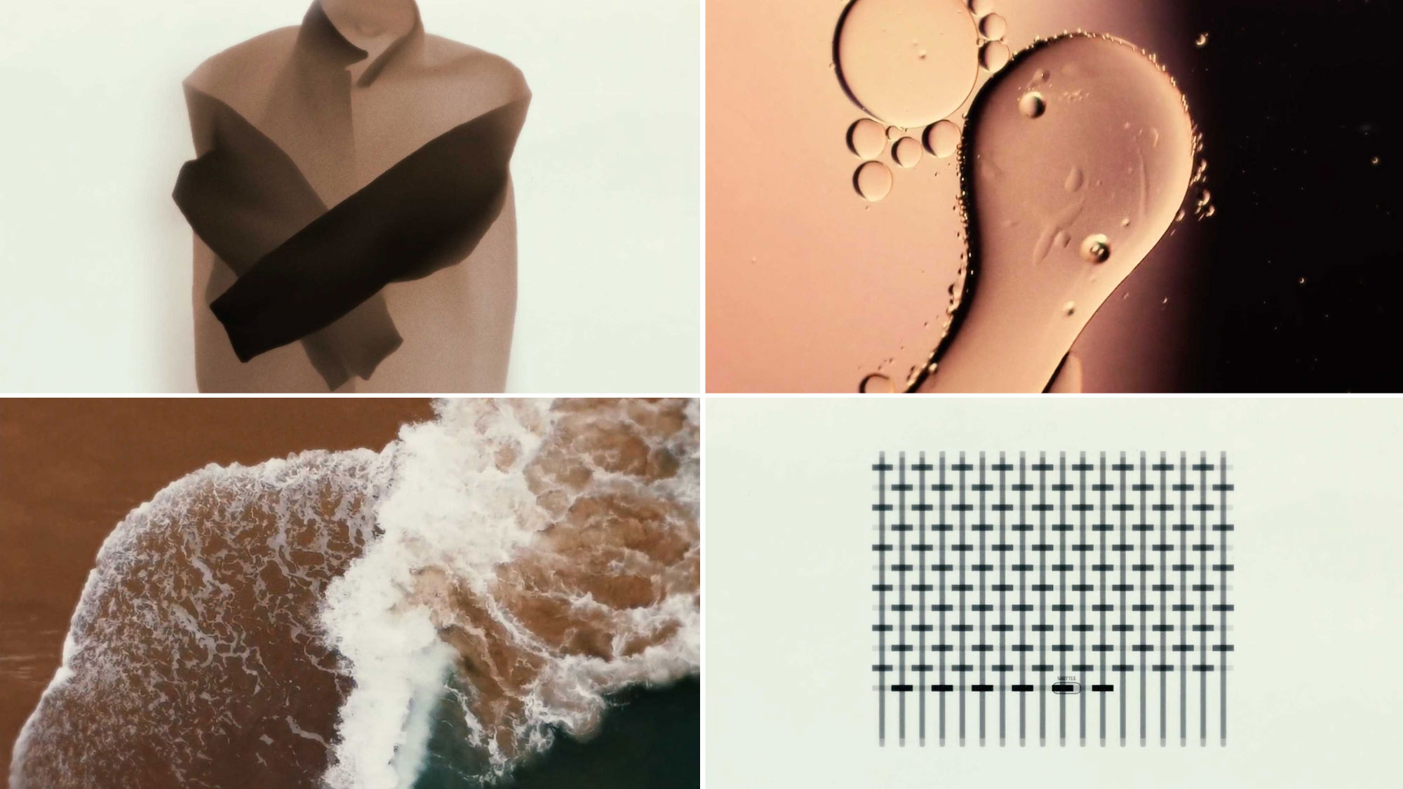
Cypher's Sonic Studies #1 starts from a jacket Joseph Sims sewed. The fabrics, tools, and machines are both the picture and the recordings. Simple animation, scans, and raw texture leave room for the sound to set the cut. John Black and Sims then warp those recordings without dropping the link to the cloth. Joris van Grunsven wrote the music. Sims animated, edited, and mixed. Sewing and sound are treated as the same job: gather, bend, assemble.
Cypher的Sonic Studies第一集,从Joseph Sims缝的一件外套开始。布料、工具和机器既是画面,也是录音来源。简单动画、扫描和粗糙纹理把节奏留给声音。John Black和Sims再把这些录音扭曲,但不切断和布的关系。Joris van Grunsven写了音乐。Sims做了动画、剪辑和混音。缝纫和声音被写成同一件事:收集、弯折、组装。
사이퍼의 소닉 스터디스 1편은 조지프 심스가 바느질한 재킷에서 시작한다. 천, 도구, 기계가 그림이자 녹음원이다. 단순한 애니메이션과 스캔, 거친 질감이 편집의 리듬을 소리에 넘긴다. 존 블랙과 심스는 그 녹음을 휘되, 천과의 연결은 끊지 않는다. 요리스 판 흐륀스번이 음악을 썼다. 심스가 애니메이션, 편집, 믹스를 맡았다. 바느질과 사운드는 같은 일로 다뤄진다. 모으고, 구부리고, 조립한다.
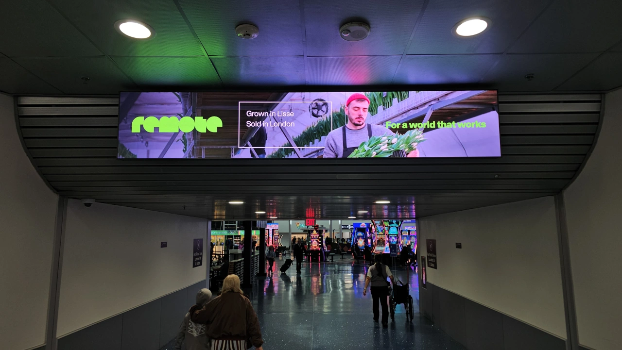
Collins rebuilt Remote, the payroll platform, around a cube that stands for a repeated unit: a brick, a container, a pallet. The cube is drawn flat, in one-point perspective, or isometric, and every edge hits the same vanishing point. The wordmark drops the old R monogram for a geometric face of half-circles and flat tops, set with a new sans called Rotina. Colors come from banknotes. Lines read like routes: Coded in Amsterdam / Deployed in Nairobi / Paid through Remote.
콜린스가 급여 플랫폼 리모트의 아이덴티티를 큐브로 다시 짰다. 큐브는 반복되는 단위, 벽돌, 컨테이너, 팔레트를 뜻한다. 도식은 평면 선, 그 다음은 일점 투시, 또는 아이소메트릭이고, 투시의 모든 모서리는 같은 소실점에 닿아야 한다. 워드마크는 옛 R 모노그램을 버리고, 반원과 평평한 꼭지로 그린 기하 글자에 새 산세리프 로티나를 붙인다. 색은 지폐에서 온다. 캠페인 문장은 경로처럼 읽힌다. 암스테르담에서 코딩 / 나이로비에 배포 / 리모트로 지급.
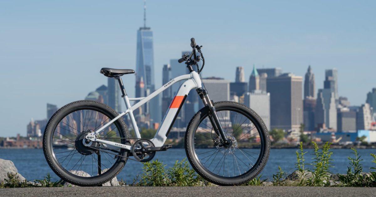
Priority's E-Sauce puts a motor on the belt-drive Sauce. A torque sensor handles assist up to 20 mph. Above that, if the rider unlocks Class 3, assist switches to cadence so the motor does not demand a sprint at 28 mph. It ships locked at 20 mph, with a 750 W rear hub, a throttle, and a single-speed Gates belt. The tail light sits in the seat tube, so a rack does not knock it off. A frame-mounted Headway Mount takes a front rack. Tires are 27.5 by 2.4 inches, and the fork travels 100 mm.
프라이어리티 E-소스는 벨트 구동 소스에 모터를 얹는다. 토크 센서가 시속 20마일까지 어시스트를 맡는다. 클래스 3를 열면 그 위는 케이던스로 바뀌어, 시속 28마일에서 전력 페달을 요구하지 않는다. 출고는 시속 20마일에 잠기고, 750W 리어 허브, 스로틀, 싱글 스피드 게이츠 벨트다. 테일라이트는 시트 튜브 안에 있어 랙이 쳐 내지 못한다. 헤드웨이 마운트가 앞 랙을 받는다. 타이어 27.5 x 2.4인치, 포크 100mm.
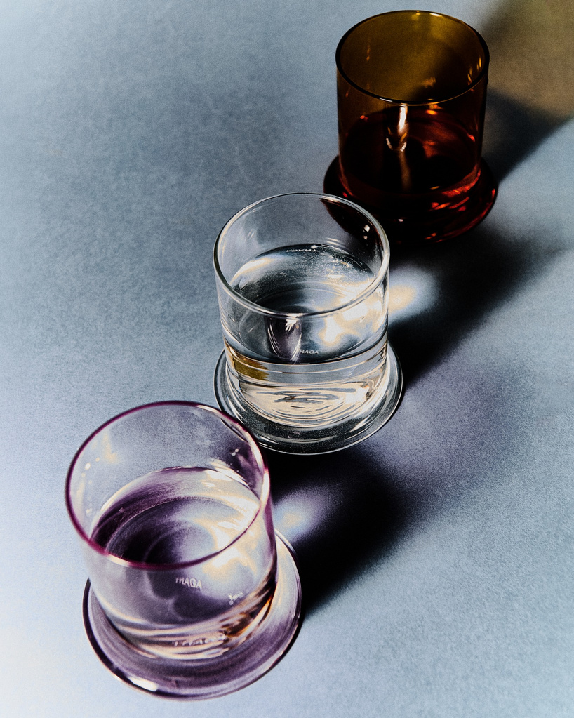
Federico Fontanella's Melt glass for TRAGA is a 300 ml borosilicate tumbler whose base bows outward, taken from the curve in the brand's logo. Filled, the drink looks as if it is melting into the table. It started clear and now also comes in pink and burnt yellow. Agata Eliseeva photographed the new colors. The glass is meant for water, whisky, or something hot. Daniel Nikolovski founded TRAGA in Milan; the base is the logo turned into a thing you can hold.
페데리코 폰타넬라가 트라가를 위해 디자인한 멜트는 300ml 붕규산 텀블러다. 바닥이 바깥으로 불룩하고, 그 곡선은 브랜드 로고에서 왔다. 채우면 음료가 테이블 속으로 녹아 들어가는 것처럼 보인다. 처음에는 투명뿐이었고, 이제 핑크와 번트 옐로가 있다. 아가타 엘리세예바가 새 색을 찍었다. 물, 위스키, 뜨거운 음료에 쓰라고 만든 잔이다. 다니엘 니콜로프스키가 밀라노에서 트라가를 세웠다. 바닥은 로고를 손에 쥘 수 있는 물건으로 바꾼 것이다.