for DC Advanced UX Team.Vivi · Yohan · Libby · Lim Jisu · Katey · Anna
Back Issue
Cockpit
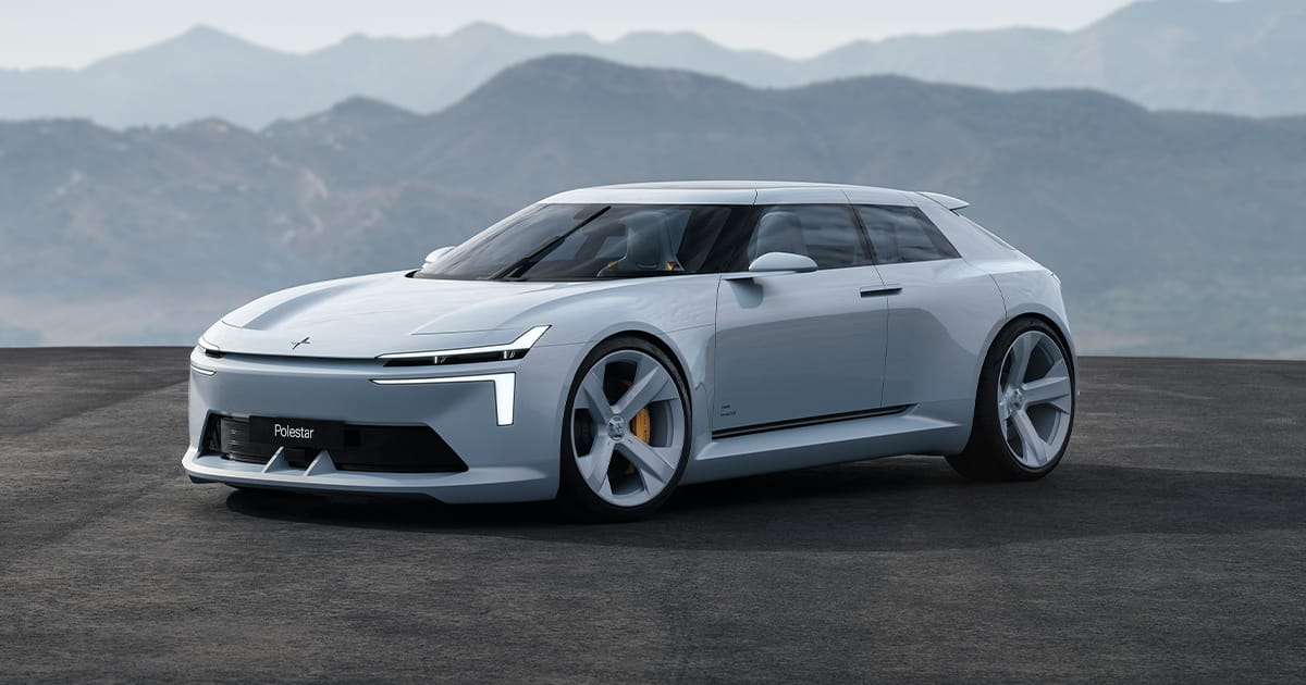
Polestar: the screen drops away
A curved 20-inch driver display, the HyperDIM, is mounted on the steering column so it stays in front of the driver when the wheel moves. Slide the console selector into Performance and the 12.2-inch centre screen drops flush into the tunnel while the wheel and that display pull toward the chest. Autonomous leaves the screen upright and moves the seat and wheel apart. Eight controls under the screen can be rockers or rotary knobs, and each one can be a hot key. Inflatable bolsters hold the four seats.
20인치 곡면 운전자 디스플레이 HyperDIM은 스티어링 칼럼에 붙어, 휠이 움직여도 운전자 앞에 남는다. 콘솔 셀렉터를 Performance로 밀면 12.2인치 센터 스크린이 터널 면과 평평해지고, 휠과 그 화면이 가슴 쪽으로 당겨진다. Autonomous에서는 화면이 서 있고 시트와 휠이 서로 벌어진다. 화면 아래 여덟 개 조작은 로커나 로터리로 바꿀 수 있고, 각각 단축키가 된다. 네 좌석은 공기 볼스터가 붙잡는다.
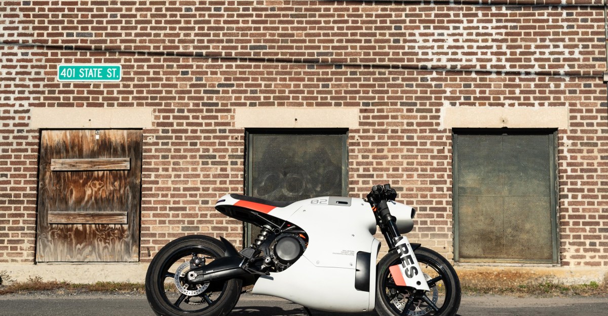
Prototype 04, called Ghost, reads as gloss black until you are close enough to see through the fairing. From the seat, charger vanes sit where a tank would be, and orange high-voltage lines run around a pack of about 15 kWh, with a J1772 port on top. Real Motors in Greenville shaped it like a Night City machine, a little Star Wars and a little Wipeout. Three speed settings, 101 horsepower, and the quoted 738 lb-ft is torque at the wheel. The ridden bike had no traction control and no ABS. It starts at $20,000.
Ghost라 불리는 프로토타입 04는 멀리서는 유광 검정이고, 다가가야 페어링 안이 보인다. 안장에서는 탱크가 있을 자리에 충전기 방열핀이 있고, 주황 고전압 선이 약 15kWh 팩을 두르며, 위에는 J1772 포트가 있다. 그린빌의 리얼 모터스가 나이트 시티처럼 깎았다. 스타워즈가 조금, 와이프아웃이 조금. 속도는 세 단, 101마력, 표기된 738lb-ft는 휠 토크다. 탄 차에는 트랙션 컨트롤도 ABS도 없었다. 시작가는 2만 달러다.
João Vaz Oliveira put nearly 100 of David Carson's Swatch sketches and finished watches into one film for Time: Destination NYC. A Cinema 4D Cloner mixes the faces at random, then he keeps the frames that still feel like Carson: type, texture, and a composition that should not work and does. Carson handed over the process work and left the cut alone. The balance, Oliveira says, is the same one he learned from the stills. Chaos, then a place where the eye can rest.
João Vaz Oliveira把David Carson近100张Swatch草图和成品表放进一条片子,Time: Destination NYC。Cinema 4D的Cloner随机混这些表面,他再留下仍然像Carson的帧:字体、纹理,还有本不该成立却成立的构图。Carson把过程稿交出来,剪辑不再插手。Oliveira说,平衡和他从静帧里学到的是同一件事。先是混乱,然后眼睛有地方停。
주앙 바즈 올리베이라는 데이비드 카슨의 스와치 스케치와 완성 시계 거의 100개를 Time: Destination NYC 한 편에 넣었다. 시네마 4D 클로너가 판면을 무작위로 섞고, 그는 여전히 카슨처럼 보이는 프레임만 남긴다. 글자, 질감, 성립하지 말아야 하는데 성립하는 구도. 카슨은 과정 작업을 넘기고 컷은 맡겼다. 올리베이라는 균형이 스틸에서 배운 것과 같다고 한다. 혼돈, 그다음 눈이 쉬는 자리.
At MAX in Miami, Adobe previewed local MCP hooks so an agent from OpenAI, Google or Anthropic can edit a Photoshop, Illustrator, Premiere or After Effects file. Layers, vectors, bins and sequences stay editable, and a person can take the file back mid-task. A private beta is set for early 2027. Always-on agents, previewed for Firefly first, can sort incoming assets or turn images into channel graphics, then wait for a yes. Firefly's assistant adds a plan you can edit before it runs, and a model picker.
마이애미 MAX에서 어도비는 로컬 MCP를 미리 보였다. OpenAI, 구글, 앤트로픽 에이전트가 포토샵, 일러스트레이터, 프리미어, 애프터 이펙트 파일을 고친다. 레이어, 벡터, 빈, 시퀀스는 편집 가능하고, 사람이 도중에 파일을 되찾는다. 비공개 베타는 2027년 초다. 상시 에이전트는 파이어플라이부터, 소재를 정리하거나 이미지를 채널 그래픽으로 만든 뒤 승인을 기다린다.
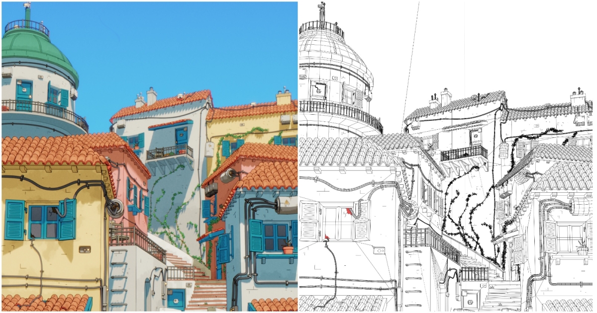
Andrew Dimov's Mediterranean street is Lisbon, Santorini and a Spanish fishing village, in EEVEE, with no Grease Pencil. Outlines come from Blender's Line Art modifier. Scratches are geometry he placed by hand. Brick variation is vertex color. The cel shader is a Diffuse BSDF into a Color Ramp, multiplied by the base color, so sun and shadow are two stops on the ramp. A hard gray-to-white gradient with a blue slope stands in for watercolor on about 70 percent of the models. The scene took 20 to 25 hours.
Andrew Dimov的地中海街道混了里斯本、圣托里尼和西班牙渔村,用EEVEE渲染,没有油脂铅笔,也没有手绘。轮廓来自Blender的Line Art修改器。划痕是他亲手摆的几何体。砖墙的颜色变化是顶点色。卡通着色是Diffuse BSDF进Color Ramp,再乘底色,阳光和阴影就是渐变上的两档。一条灰到白的硬渐变加上蓝色斜坡,在大约七成模型上充当水彩。整场用了20到25小时。
앤드루 디모프의 지중해 거리는 리스본, 산토리니, 스페인 어촌을 섞은 장면이다. EEVEE이고, 그리스 펜슬은 없다. 외곽선은 블렌더 라인 아트다. 긁힘은 손으로 놓은 지오메트리, 벽돌 색은 버텍스 컬러다. 셀 셰이더는 Diffuse BSDF를 컬러 램프로 보낸 뒤 베이스 컬러와 곱한다. 해와 그림자는 램프의 두 단이다. 회색에서 흰색으로 가는 단단한 그라데이션에 파란 기울기를 더해, 약 70퍼센트에서 수채를 대신한다. 20시간에서 25시간.
Porto Rocha rebuilt Fursys, the Korean workplace maker from 1983, around a single corner. The wordmark and the symbol, called The Corner, share one grid. Fursys Sans is a custom geometric with matching Latin and Korean sets, so Seoul and the US set the same voice. White type sits on black, with the old red plus deep blue and green. Stationery is blind-stamped, not printed. A felt binder has the corner cut out of its side. The line on the truck reads Design for the unseen.
Porto Rocha把1983年创立的韩国办公品牌Fursys收成一个角。字标和名叫The Corner的符号共用一张网格。定制几何字体Fursys Sans有成套的拉丁文和韩文,首尔和美国说同一种声音。白字落在黑底上,旧红加上深蓝和绿。信纸是压凹,不是印上去的。毛毡活页夹侧面被切掉那个角。车上的句子是Design for the unseen。
포르투 로샤는 1983년 한국 오피스 브랜드 퍼시스를 하나의 모서리로 다시 짰다. 워드마크와 The Corner라는 심볼이 한 그리드를 쓴다. 커스텀 지오메트릭 퍼시스 산스는 라틴과 한글 세트가 짝을 이뤄, 서울과 미국이 같은 목소리다. 흰 글자는 검정 위에 앉고, 오래된 빨강에 짙은 파랑과 초록이 붙는다. 문구는 인쇄가 아니라 블라인드 스탬프다. 펠트 바인더 옆면에는 그 모서리가 잘려 있다. 트럭의 문장은 Design for the unseen이다.
Trizz in Barcelona, with Across the Pond, made a film for Google Security that refuses servers and code. Oriol Puig built a board of simple shapes: the Google mark, the size of the network, data on the move, a threat, a hole, and the agents that go looking. The hero is one icon. It travels, multiplies when the model needs to search more than one place, and patches what it finds. The environments change without a cut, scored like a short adventure. The job was to make something invisible readable in a single pass.
巴塞罗那的Trizz和Across the Pond为Google Security做了一条不用服务器、也不用代码的片子。Oriol Puig先排了一块简单形状的板:Google标志、网络的尺度、在移动的数据、威胁、漏洞,以及去找它们的代理。主角是一个图标。它旅行,模型需要同时搜几个地方时就分裂,然后补上找到的洞。场景切换不靠剪,配乐像一条短篇冒险。任务是让看不见的东西一遍就能读懂。
바르셀로나의 트리즈는 어크로스 더 폰드와 함께 구글 시큐리티 필름을 만들었다. 서버도 코드도 없다. 오리올 푸이그는 단순한 형태의 보드를 깔았다. 구글 마크, 네트워크의 크기, 움직이는 데이터, 위협, 구멍, 그리고 그것을 찾으러 가는 에이전트. 주인공은 아이콘 하나다. 여행하고, 모델이 여러 곳을 동시에 뒤져야 하면 갈라지며, 찾은 구멍을 메운다. 환경은 컷 없이 바뀌고, 음악은 짧은 모험처럼 흐른다. 과제는 보이지 않는 것을 한 번에 읽히게 하는 일이었다.
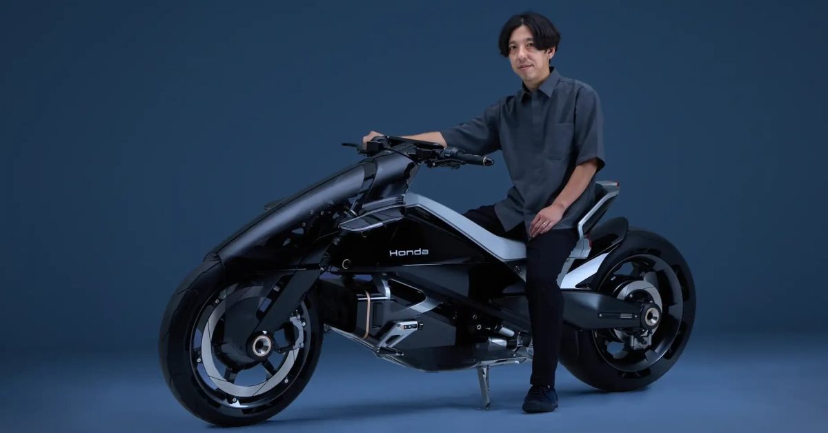
Honda's EV Outlier, back on the EICMA floor after the Japan Mobility Show, puts a motor in each wheel and drops the rider behind a black central pack. Glass mirrors are gone. Cameras feed a wide cockpit that can show lean angle, riding modes, front-motor torque and what both wheels are doing at once. A bucket backrest takes the shove of acceleration and lets the hips pivot. Honda's three words for it are Gliding, Ecstasy, and Low. The low eye-line is the point of the last one.
혼다 EV 아웃라이어는 재팬 모빌리티 쇼 이후 EICMA 바닥에 다시 나왔다. 각 휠에 모터가 있고, 라이더는 검은 중앙 팩 뒤, 아주 낮게 앉는다. 유리 미러는 없다. 카메라가 넓은 콕피트를 먹이고, 그 화면은 린 앵글, 라이딩 모드, 앞 모터 토크, 두 휠이 지금 하는 일을 함께 그릴 수 있다. 버킷 등받이는 가속의 밀림을 받고 골반이 축이 되게 한다. 혼다의 세 단어는 Gliding, Ecstasy, Low다. 마지막 단어의 핵심은 눈높이를 낮춘 것이다.
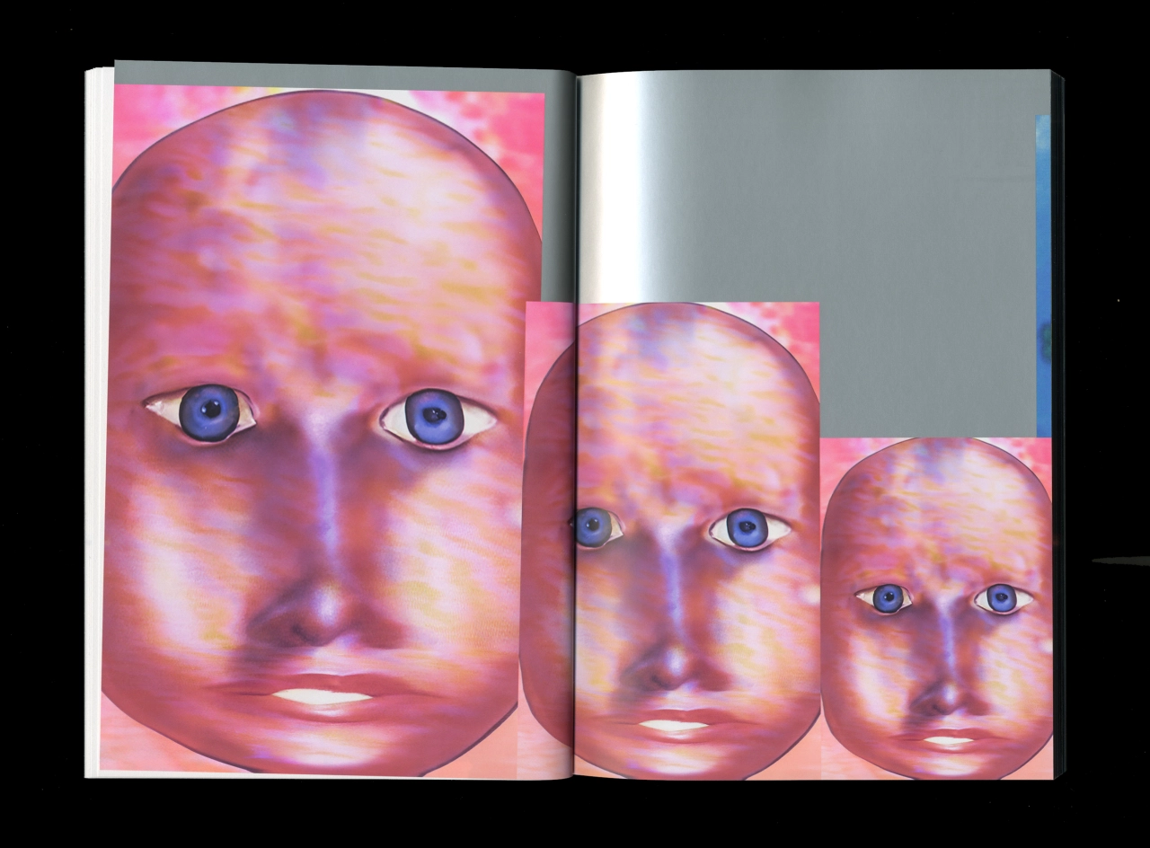
Julien Gobled, in Le Havre, crops and warps photographs until they look photocopied. Derrière le soleil took two years with Fidèle Éditions and Éditions Biceps. Jean-Philippe Bretin did the layout. The pictures were made in three months. For Oneohtrix Point Never's Tranquilizer, on Warp, he shared art direction with Elliott Elder at Uncanny. The cover is Abner Hershberger's screen print. Million Goods posters, with Gabriel Finotti, start from Bauhaus and Brutalism, then refuse the homage.
勒阿弗尔的Julien Gobled把照片扭到像反复复印。Derrière le soleil与Fidèle、Biceps做了两年,版式Bretin,图用三个月。Warp专辑Tranquilizer与Elliott Elder共做美术,封面是Hershberger的丝网。Million Goods海报从包豪斯与粗野主义出发,再拒绝致敬。
르아브르의 줄리앙 고블레드는 사진을 자르고 뒤틀어 복사본처럼 만든다. Derrière le soleil은 피델, 비셉스와 2년, 레이아웃은 장필리프 브레탱, 그림은 석 달이었다. 워프의 원오트릭스 포인트 네버 Tranquilizer는 언캐니의 엘리엇 엘더와 아트 디렉션을 나눴다. 표지는 애브너 허시버거의 실크스크린. 가브리엘 피노티와 한 밀리언 굿즈는 바우하우스와 브루탈리즘에서 시작해 오마주를 거절한다.
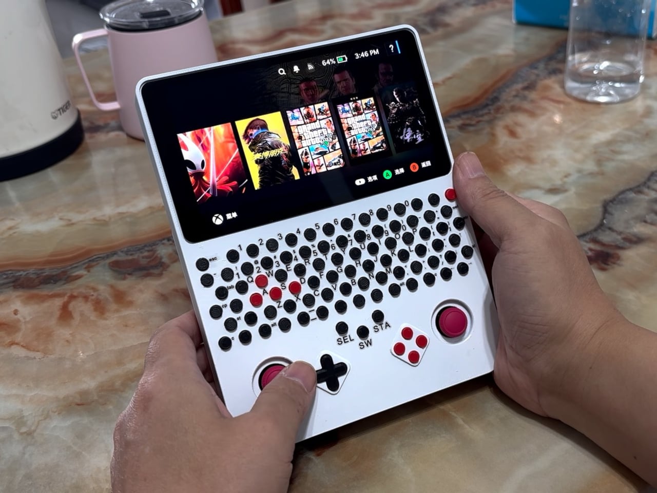
LCLDIY stood a Steam Deck motherboard on end. A 5.5-inch screen sits on top, still landscape, and a field of tiny round keys sits between it and the controls: a number row, letters, red WASD among black. Below that, two red sticks flank a black D-pad and four red face buttons. Thumbs play under the screen. Typing means reaching up, so the keyboard does not cover the picture. The keys are a custom board, with firmware, in a printed shell that used water-soluble supports. It still runs SteamOS.
LCLDIY는 스팀 덱 메인보드를 세웠다. 5.5인치 화면이 맨 위에 있고, 여전히 가로다. 화면과 조작 사이에는 작은 원형 키가 깔린다. 숫자 줄, 문자, 검은 키 사이의 빨간 WASD. 그 아래 빨간 스틱 두 개가 검은 십자 패드와 빨간 페이스 버튼 네 개를 끼고 있다. 엄지는 화면 아래에서 놀고, 타자는 위로 손을 뻗는다. 키보드가 그림을 가리지 않는다. 키는 펌웨어가 있는 맞춤 기판이고, 껍질은 수용성 서포트를 쓴 출력이다. 여전히 SteamOS다.
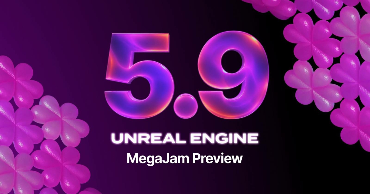
Epic's 5.9 MegaJam Preview is the first Unreal release built mainly by agents, in about a week, for the jam on 12 to 15 November. Web is back: WebAssembly plus WebGPU, on the mobile renderer, and parts of that renderer are still prototypes. The drop adds Unreal MCP, an in-editor assistant for Claude Code, Codex or Cursor, and Unreal Canvas for prompted images, meshes and video. Lumen World Cache and tighter Nanite culling sit in the rendering pile. QA was shorter than a normal preview.
Epic的5.9预览是首个主要由代理搭起的Unreal,约一周,为12至15日的jam。网页回来了:WebAssembly加WebGPU,移动端渲染器,部分仍是原型。同批有Unreal MCP,可连Claude Code、Codex或Cursor,以及用提示做图像、网格和视频的Unreal Canvas。另有Lumen World Cache和更紧的Nanite剔除。测试比常规预览短。
에픽 5.9 메가잼 프리뷰는 주로 에이전트가 만든 첫 언리얼이다. 11월 12–15일 잼에 맞춰 약 일주일. 웹이 돌아왔다. WebAssembly와 WebGPU, 모바일 렌더러, 그 일부는 아직 프로토타입이다. 언리얼 MCP, 클로드 코드·코덱스·커서와 말하는 에디터 도우미, 프롬프트로 이미지·메시·영상을 만드는 언리얼 캔버스가 같이 온다. 렌더에는 루멘 월드 캐시와 더 촘촘한 나나이트 컬링. QA는 보통 프리뷰보다 짧다.
PlugShare 8.0 is on iPhone from 10 November. Dark mode follows the phone, including the sunset switch. Each trip stop shows distance from the start and from the previous charger. Station photos open from the thumbnail. The layout refolds for the iPhone Duo. The Watch app lists nearby plugs with the phone's filters, a PlugScore, the network and the connector, NACS, CCS, CHAdeMO or J1772, and refreshes when the wrist comes up. Android dark mode and Material 3 wait until early 2027.
플러그셰어 8.0은 11월 10일부터 아이폰에 있다. 다크 모드는 휴대폰을 따르고, 해 질 녘 전환도 포함한다. 각 정류장은 출발점과 이전 충전기까지의 거리를 보여 준다. 사진은 썸네일에서 열린다. 레이아웃은 아이폰 듀오에 맞춰 접힌다. 워치 앱은 휴대폰 필터로 근처 플러그를 나열하고, PlugScore, 네트워크, NACS·CCS·CHAdeMO·J1772를 보여 주며, 손목을 들면 새로고침한다. 안드로이드 다크 모드와 Material 3는 2027년 초다.
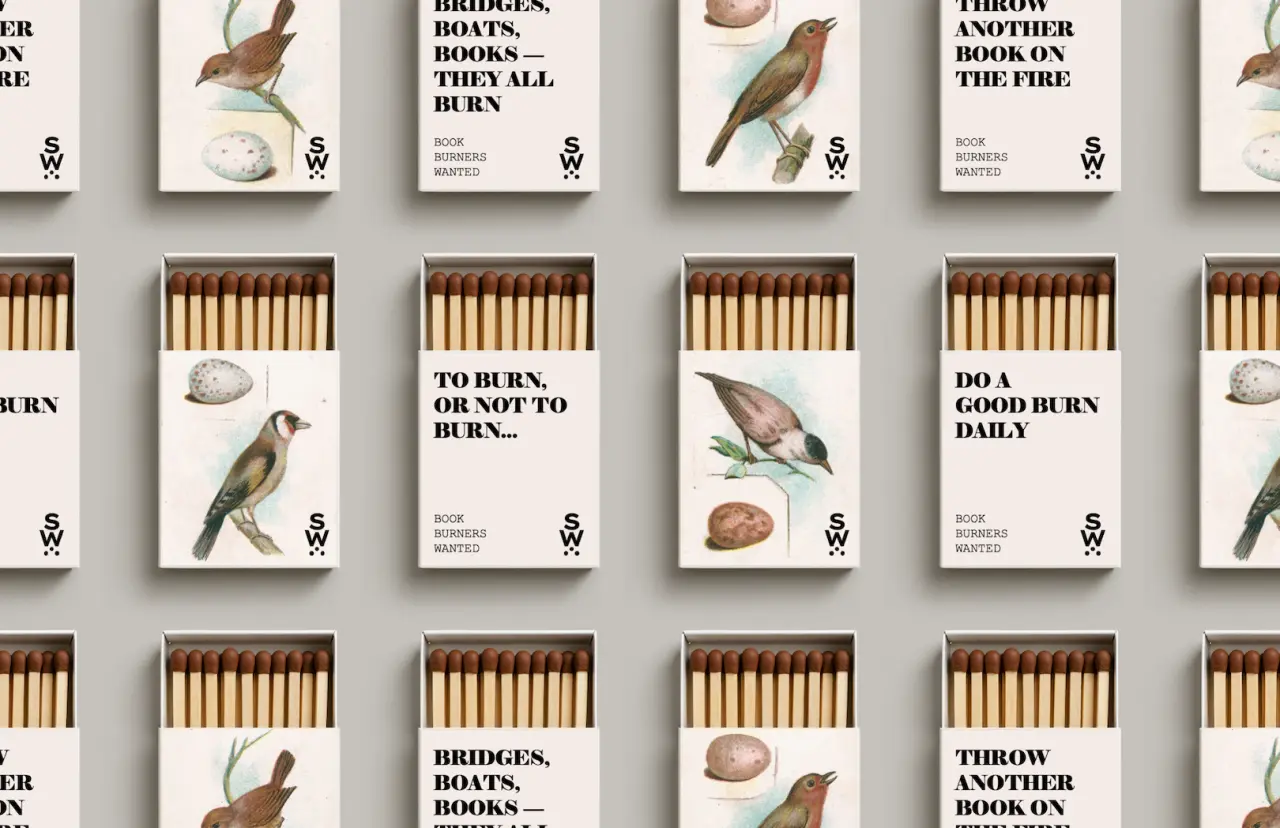
Sitting Wren, a small publisher of novels set in older eras, printed a campaign called Book Burners Wanted. Ryan Hewlett, creative director and author, made matchboxes in the same proportion as books, meant to sit on a shelf instead of going in the bin. The line borrows Fahrenheit 451 and the other meaning of burning a book, a story etching itself chapter by chapter. The drawings stay in the house style of birds, pulled toward Edwardian, Gilded Age and mid-century craft. The object is the ad.
옛 시대 소설을 내는 작은 출판사 시팅 렌이 Book Burners Wanted라는 캠페인을 찍었다. 크리에이티브 디렉터이자 작가인 라이언 휴렛은 책과 같은 비례의 성냥갑을 만들었다. 쓰레기통 대신 선반 위에 두라고. 문장은 화씨 451과, 책을 태운다는 다른 뜻을 빌린다. 이야기가 한 장씩 새겨지는 일. 그림은 이 집의 새이고, 에드워드 시대, 도금 시대, 세기중반의 공예 쪽으로 당겨져 있다. 물건이 광고다.
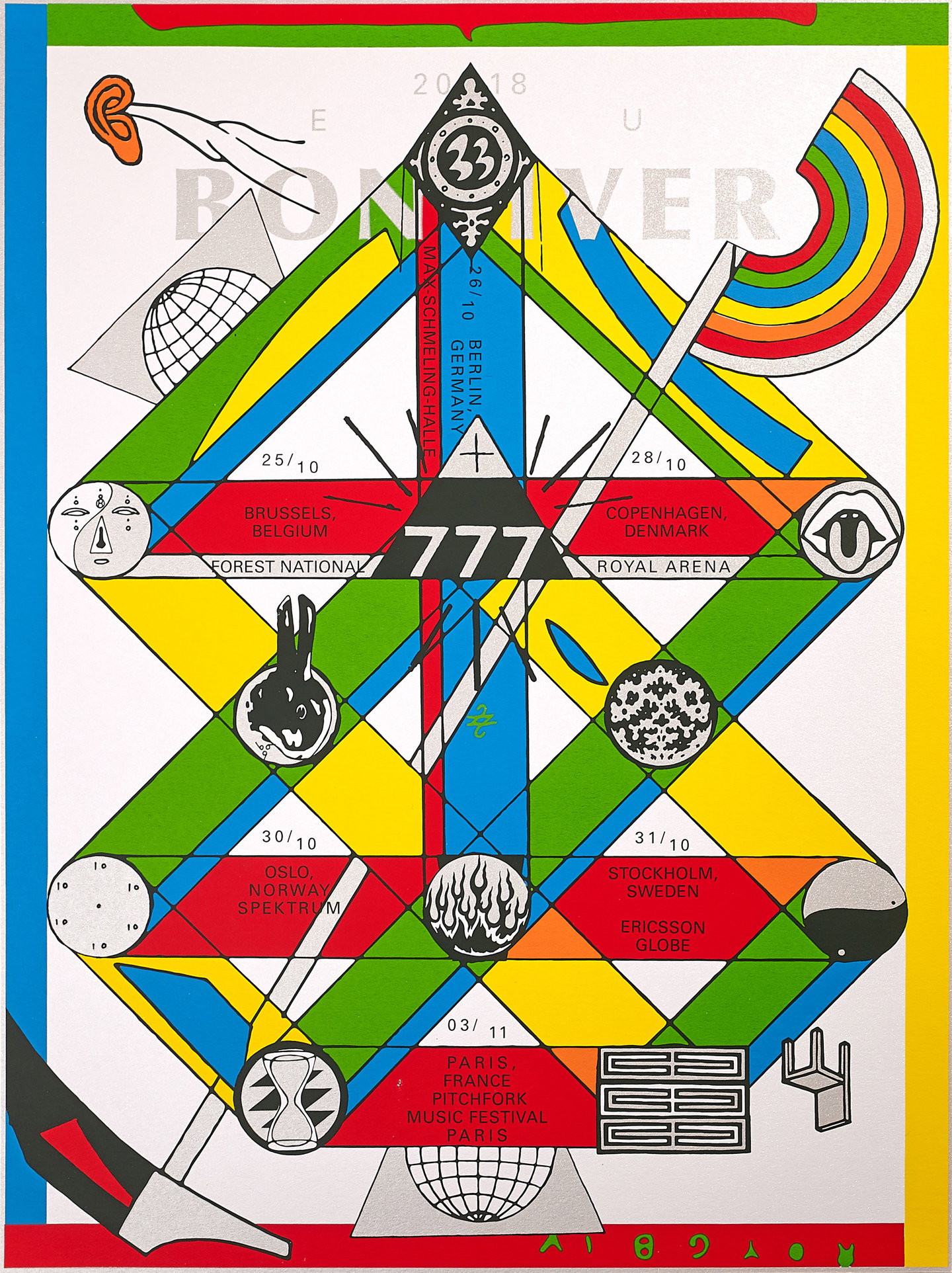
For the tenth year of Bon Iver's 22, A Million, Eric Timothy Carlson inverted the cover, black to white, the yin-yang he was given for the number 22. The symbols started as 100 drawings, printed onto three collages of 33 by 33 inches. A 10 is an inverted ankh. A 21 sits near a sign for a moon of Jupiter. With Aaron Anderson he cut a supercut of the lyric films from phone video, desktop captures and After Effects, in Spanish, French and Japanese. The digital half was system fonts and flat RGB.
Bon Iver《22, A Million》十周年,Eric Timothy Carlson把封面从黑反到白,就是数字22的那个阴阳。符号从100张草图开始,印在三张33乘33英寸拼贴上。10是倒过来的安卡。21靠近木星一颗卫星的符号。他和Aaron Anderson用手机视频、桌面截屏和After Effects做了歌词影像总集,有西班牙语、法语和日语。数字的一半是系统字体和平RGB。
본 이베어 22, A Million 10년, 에릭 티머시 칼슨은 표지를 검정에서 흰색으로 뒤집었다. 숫자 22의 음양이다. 기호는 그림 100장에서 33×33인치 콜라주 세 장에 찍혔다. 10은 뒤집힌 앙크, 21은 목성 위성 기호 옆이다. 아론 앤더슨과 휴대폰 영상, 데스크톱 캡처, 애프터 이펙트로 가사 수퍼컷을 만들었고, 스페인어·프랑스어·일본어가 있다. 디지털 절반은 시스템 서체와 평평한 RGB다.
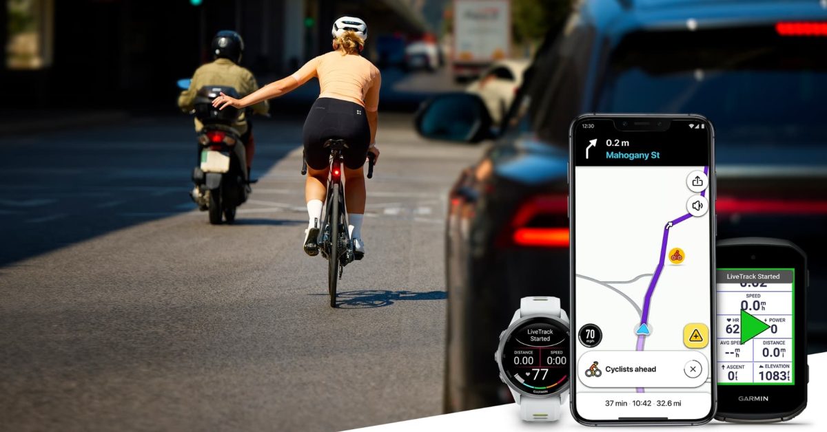
A cyclist on a Garmin Edge, or a Garmin watch, can opt in through Garmin Connect. Starting an outdoor ride sends a moving icon to nearby Waze drivers. No name travels with it, and the share ends when the session does. LiveTrack used to reach only the people you picked. This puts the same dot on the map a driver is already watching, on iOS and Android, as the rollout starts. The picture is small on purpose: one mark, moving, easy to miss if the icon is timid.
가민 엣지나 가민 워치를 쓰는 라이더는 가민 커넥트에서 참여를 고를 수 있다. 야외 라이딩을 시작하면 움직이는 아이콘이 근처 웨이즈 운전자에게 간다. 이름은 따라가지 않고, 세션이 끝나면 공유도 끝난다. 라이브트랙은 고른 사람에게만 갔다. 이제는 운전자가 이미 보고 있는 지도 위의 같은 점이 된다. iOS와 안드로이드에서 배포가 시작됐다. 그림은 일부러 작다. 점 하나, 움직이는 점.
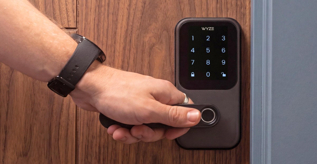
The fingerprint reader on Wyze's Lever Lock sits in the end of the handle, where the thumb already is. One motion is meant to identify you, unlock, and unlatch in under half a second, so the door gesture is the authentication. It is $99.98, with Wi-Fi 6, and Wyze rates it at up to 12 months on eight AA batteries. The handle is the sensor. There is no separate pad to find before you pull.
Wyze Lever Lock的指纹读头在把手末端,拇指本来就在那里。一次动作要在半秒内完成识别、开锁和松开闩,开门的手势就是验证。售价99.98美元,带Wi-Fi 6,Wyze说八节AA电池可以用到12个月。把手就是传感器。拉动之前,没有另一块要找的面板。
와이즈 레버 록의 지문 리더는 손잡이 끝에 있다. 엄지가 이미 닿는 자리다. 한 동작으로 반초 안에 식별하고, 잠금을 풀고, 래치를 연다. 문을 여는 제스처가 인증이다. 99.98달러이고, Wi-Fi 6가 있으며, 와이즈는 AA 여덟 개로 최대 12개월이라고 한다. 손잡이가 센서다. 당기기 전에 따로 찾을 패드가 없다.