for DC Advanced UX Team.Vivi · Yohan · Libby · Lim Jisu · Katey · Anna
Back Issue
Interaction
Backglow: the logo keeps the beat
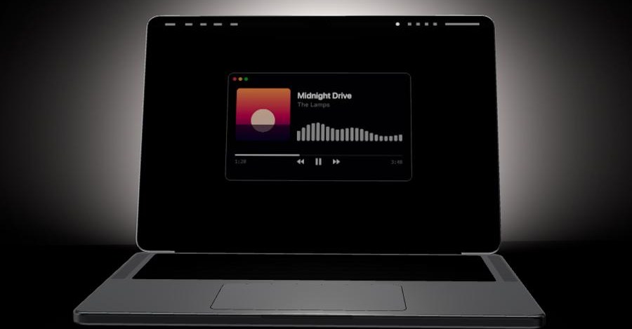
Juan Buis built Backglow for the MacBook Pro whose lid logo is its own white LED. macOS ties that glow to screen brightness and the room, and the official off switch is a Terminal command. The free menu-bar app adds a slider, a one-click off, Breathe, and a Battery mode that dims as the charge falls. Pro, $9 at launch and $15 later, pulses the logo to whatever the Mac is playing, or ties it to Claude Code: a soft glow while it waits, a steady pulse while it works, a double blink when it needs you.
Juan Buis为新款MacBook Pro做了Backglow。盖子上的苹果标志是一颗独立的白色LED。macOS把亮度绑在屏幕亮度和环境光上,官方关闭方式是一条终端命令。免费菜单栏应用加上滑杆、一键关闭、呼吸,以及随电量变暗的Battery。Pro首发9美元、之后15美元:标志跟着Mac正在播放的声音跳,或绑到Claude Code,等待时微光,工作时稳脉冲,需要你时连闪两下。
후안 부이스가 만든 백글로우는, 뚜껑 로고가 흰색 LED인 맥북 프로용이다. macOS는 그 빛을 화면 밝기와 방의 조도에 묶고, 공식적인 끄기는 터미널 명령이다. 무료 메뉴 막대 앱은 슬라이더, 한 번의 끄기, 브리드, 배터리 모드를 더한다. 프로는 출시 때 9달러, 이후 15달러다. 로고가 맥이 재생하는 소리에 맞거나, 클로드 코드에 묶인다. 기다릴 때 은은하고, 일할 때 맥박처럼, 사람이 필요하면 두 번 깜빡인다.
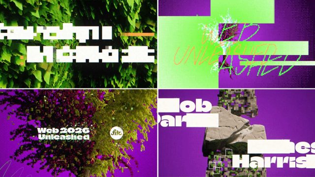
Escafandra's titles for FITC Web Unleashed 2026 leave the hand-drawn look of the studio's spring FITC film. Luis Mejia and Julieta Tobon built stylized 3D, illustrated textures on the leaves and branches, then voxels, pixels and dither. The story continues FITC Toronto: Rebirth, which ended on a totem of cel, 2D and 3D. This one is decay. The systems break, the picture loses information on purpose, and new growth comes through the gaps. Pixelated type took the most passes. Leo Grand did the music.
Escafandra给FITC Web Unleashed 2026做的片头,放下了春天那条FITC片子的手绘样子。Luis Mejia和Julieta Tobon做了风格化三维,加上体素、像素和抖动。故事接在FITC Toronto: Rebirth之后,那条停在赛璐璐、二维和三维合成的图腾上。这一条是衰败:系统裂开,画面故意丢掉信息,新的生长从缺口里出来。像素化的字改得最多。
에스카판드라의 FITC 웹 언리시드 2026 타이틀은 올봄의 손그림 결을 버린다. 루이스 메히아와 훌리에타 토본은 양식화된 3D에 잎과 가지의 일러스트 질감을 올리고, 복셀과 픽셀, 디더를 더했다. 이야기는 셀과 2D와 3D가 토템으로 끝난 FITC 토론토: 리버스에서 이어진다. 이번은 붕괴다. 체계가 깨지고, 화면은 일부러 정보를 잃으며, 새 성장이 틈으로 나온다. 픽셀 서체에 패스가 가장 많이 갔다. 음악은 레오 그랑이다.
At Adobe MAX, Walt Disney Imagineering Research and Development is already running a sketch-to-image model on Firefly Foundry. A hand drawing comes back as rendered 2D concept art for the theme-park pipeline. A second custom model makes assets that stay on-brand for a franchise, trained on character, place and style. The models are artist-led, and the point is a commercially safe picture a designer can keep. StudioLAB and ESPN Edge are in the same collaboration, prototyping tools rather than a single prompt bar.
마이애미비치의 어도비 맥스에서, 월트 디즈니 이매지니어링 연구개발은 이미 파이어플라이 파운드리의 스케치-투-이미지 모델을 돌리고 있다. 손으로 그린 그림이 테마파크 파이프라인의 렌더된 2D 콘셉트 아트로 돌아온다. 두 번째 맞춤 모델은 캐릭터, 장소, 스타일로 학습되어, 프랜차이즈에 맞는 에셋을 만든다. 모델은 아티스트가 이끌고, 디자이너가 남길 수 있는 상업적으로 안전한 그림을 겨냥한다. 스튜디오랩과 ESPN 에지도 같은 협업에서 도구를 시제품으로 만든다.
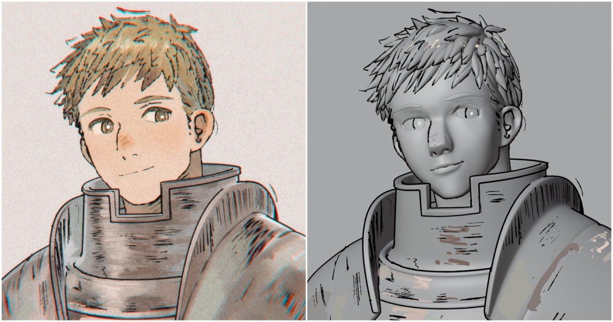
Mani Salguero's portrait of Laios, from Delicious in Dungeon, starts from fan art by Maeka and keeps the ink. Grease Pencil draws the outlines. The outer contour is an inverted hull. Blocking was Maya, the sculpt ZBrush, the last pass Blender, the paint Substance 3D Painter. Hair took the longest: the flat shapes had to become volumes without losing the drawing. Noise and Eevee finish the frame. The palette sits close to Akihiko Yoshida, muted, with a line that still reads as ink on paper.
Mani Salguero画的莱欧斯来自《迷宫饭》,底稿是Maeka的同人图,墨线留着。轮廓用Grease Pencil。外轮廓是反向壳体。大型在Maya,雕刻在ZBrush,最后一遍在Blender,贴图在Substance 3D Painter。头发最久:平面形状要变成体积,画的感觉不能丢。噪波和Eevee收尾。配色接近Akihiko Yoshida,发闷,线条仍像纸上的墨。
마니 살게로의 라이오스 초상은 《던전밥》에서 왔고, 마에카의 팬 아트에서 시작해 먹선을 남긴다. 외곽선은 그리스 펜슬이고, 바깥 윤곽은 뒤집힌 헐이다. 블로킹은 마야, 스컬프트는 지브러시, 마지막 패스는 블렌더, 페인트는 섭스턴스 3D 페인터다. 머리카락이 가장 오래 걸렸다. 평면 형태가 부피가 되면서도 그림이 남는다. 노이즈와 이브이가 프레임을 닫는다. 팔레트는 아키히코 요시다에 가깝고, 선은 종이 위의 먹으로 읽힌다.
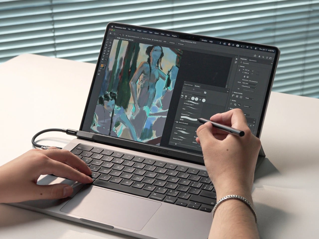
Intricuit's Magic Screen snaps to the lid magnets on a MacBook and lays a capacitive glass over the panel you already have. Ten fingers, 8 ms, a claimed 99 percent transparency, 0.6 watts over one USB-C cable. The 14-inch sheet weighs 122.8 grams, the 16-inch 172.6. The pen is USI 2.0, with 4,096 pressure levels, hover from 10 mm, palm rejection and a 100-hour battery. Off the lid it lies flat as a tablet. It fits M1 and newer Pros, M2 and newer Airs, and the MacBook Neo. The M1 Air is out. Price is $179.
인트리쿠이트의 매직 스크린은 맥북 뚜껑의 자석에 붙고, 이미 있는 패널 위에 정전식 유리를 올린다. 손가락 열 개, 8밀리초, USB-C 한 줄로 0.6와트다. 14인치는 122.8그램, 16인치는 172.6그램이다. 펜은 USI 2.0이고, 압력 4,096단계, 10밀리미터 호버, 팜 리젝션, 배터리 100시간이다. 뚜껑에서 떼면 평평한 타블렛이 된다. M1 이후 프로, M2 이후 에어, 맥북 네오에 맞는다. M1 에어는 빠진다. 179달러다.
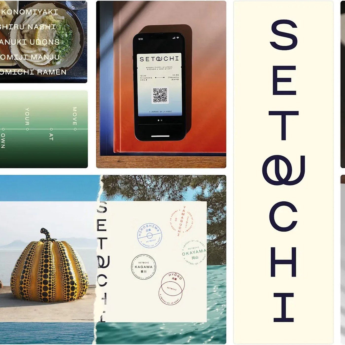
Saffron asked Blaze Type for Setouchi Sans, and the foundry did not draw a new family. It adapted Osmose, its catalogue sans, and changed the one thing that shows: an interlocking OU ligature. The join is the wordmark, and it also fires inside headlines and text whenever those two letters meet, so the mark lives in the font file rather than pasted on a layout. Kerning was retuned across the weights. Several offices produce the region's materials, and they all get the ligature.
사프론은 블레이즈 타입에 세토우치 산스를 맡겼고, 파운드리는 새 가족을 그리지 않았다. 카탈로그의 산스인 오스모스를 고쳤고, 눈에 띄는 변화는 맞물리는 OU 리가처 하나다. 그 이음이 워드마크이고, 두 글자가 만나는 헤드라인과 본문에서도 켜진다. 마크는 레이아웃에 붙는 대신 폰트 파일 안에 산다. 커닝은 웨이트마다 다시 맞췄다. 지역의 자료를 만드는 여러 사무실이 같은 리가처를 받는다.
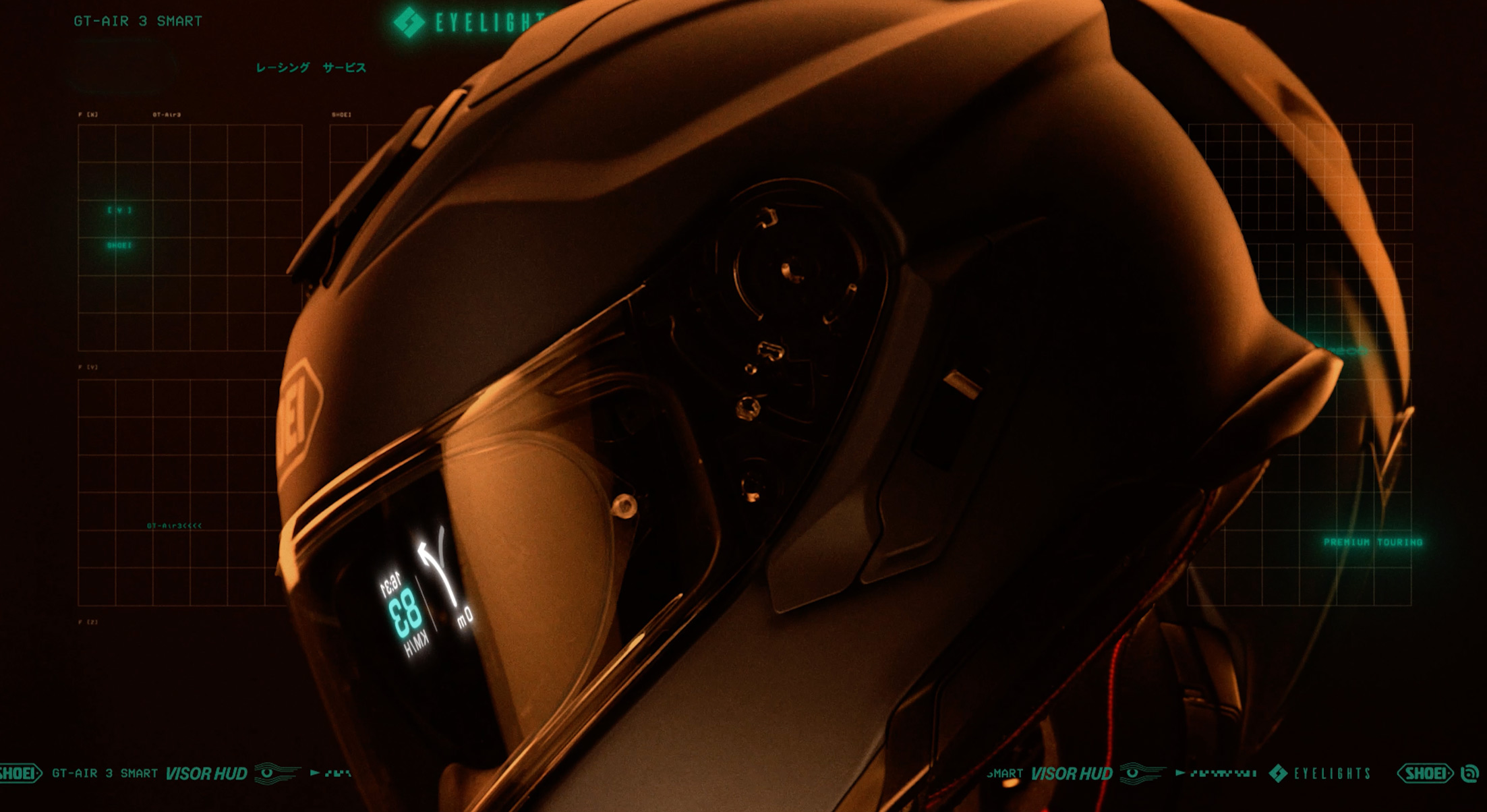
Shoei's GT-Air 3 Smart takes an optional EyeLights visor HUD. A full-HD Nano-OLED sits on the sun visor, and speed, GPS, calls, radar, music and a mini-map are drawn about three metres ahead. The sun visor does not have to drop all the way. Siri and Google sit in the helmet, and the battery is rated past 10 hours. Mesh works online or offline. The shell is still a GT-Air, ECE 22/06, with the display built for the visor rather than clipped on as glasses.
쇼에이 GT-에어 3 스마트는 선택형 아이라이츠 바이저 HUD를 받는다. 풀 HD 나노 OLED가 선바이저에 있고, 속도, GPS, 통화, 레이더, 음악, 미니 맵이 약 3미터 앞에 그려진다. 선바이저를 끝까지 내리지 않아도 된다. 시리와 구글이 헬멧 안에 있고, 배터리는 10시간을 넘긴다고 적혀 있다. 메시는 온라인과 오프라인 모두 된다. 껍질은 여전히 GT-에어이고 ECE 22/06이며, 디스플레이는 안경처럼 클립하는 대신 바이저용으로 만들어졌다.
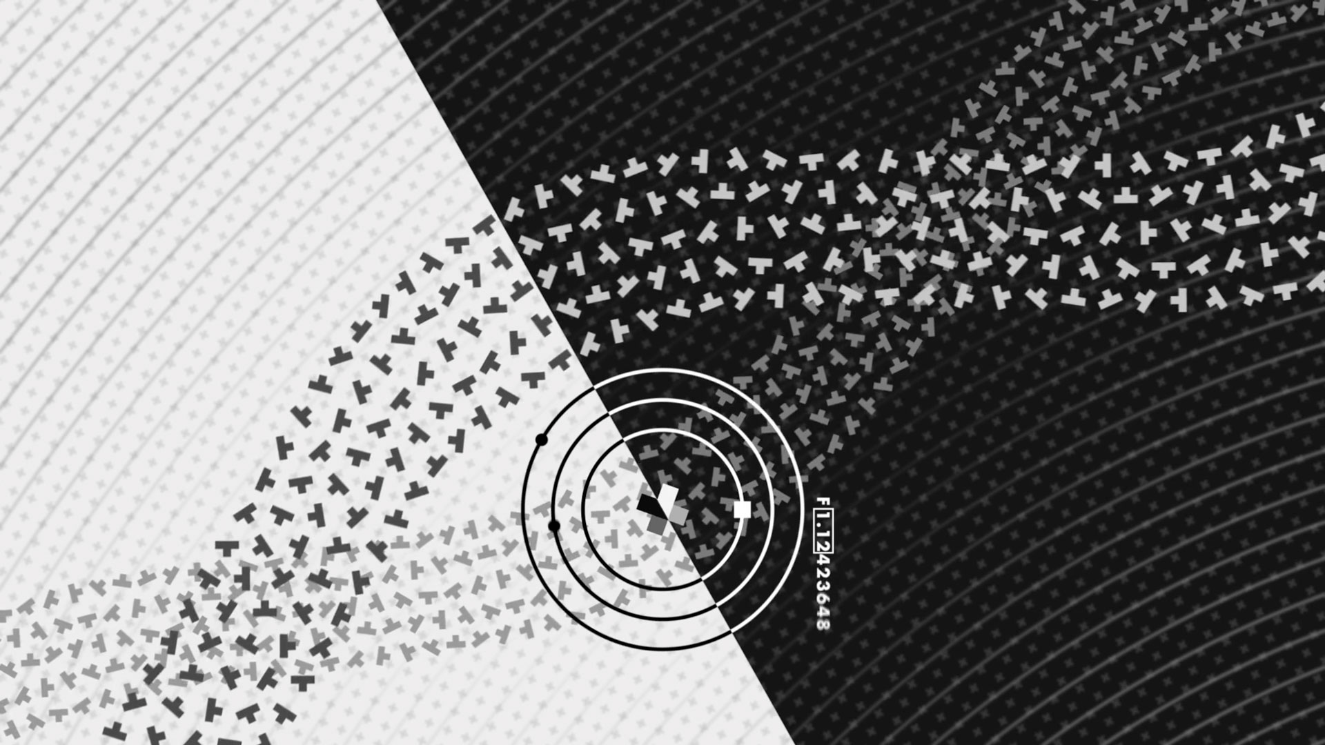
Renaud Hallée's PLUS is seven minutes of a plus sign cutting a path toward rebirth, made at Possible Metrics in Montreal. Every frame had to land on the beat. A mistake could not hide behind a cut or a filter, and the motion could not feel like a loop. He started without scripts in After Effects, wanting the placement to stay deliberate, then wrote scripts once the element count got away from him. Audio is Reaper. The last passage is still After Effects, which he would rebuild in a 3D package if he did it again.
르노 알레의 PLUS는 7분짜리로, 더하기 기호 하나가 다시 태어나는 길을 낸다. 몬트리올의 포시블 메트릭스에서 만들었다. 모든 프레임이 박자에 맞아야 했다. 실수는 컷이나 필터 뒤에 숨을 수 없고, 움직임이 루프처럼 느껴져서도 안 된다. 그는 애프터 이펙트에서 스크립트 없이 시작했고, 배치가 의도적으로 남기를 바랐다. 요소가 많아지자 스크립트를 썼다. 오디오는 리퍼다. 마지막 구간은 여전히 애프터 이펙트이고, 다시 한다면 3D로 옮기겠다고 했다.
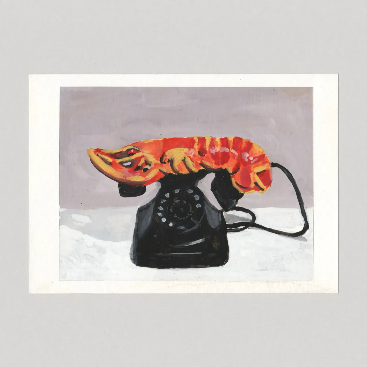
Chris Coombes paints museum postcards back into A6 gouache. He buys the card, photographs it, and traces with a camera lucida app onto watercolour paper cut to the same size, margins masked to match. Two coats of varnish, then a scan. Richter, Duchamp, Warhol, Matisse's Snail, Dali's lobster telephone. Bridget Riley's Hesitate, a field of dots changing tone, was the one he could not finish cleanly. The series sits under Modern Britain, the shop he runs for a museum that does not exist.
Chris Coombes把博物馆明信片画回A6水粉。他买下卡片,拍照,用手机上的明箱照相应用描到裁成同样大小的水彩纸上,白边用胶带对齐。上清漆两遍,再扫描。里希特、杜尚、沃霍尔、马蒂斯的《蜗牛》、达利的龙虾电话。布里奇特·莱利的《Hesitate》是一片变调的圆点,他没能画干净。系列挂在Modern Britain下面,那是他为一个不存在的博物馆开的商店。
크리스 쿰스는 박물관 엽서를 A6 과슈로 다시 그린다. 카드를 사서 찍고, 휴대폰의 카메라 루시다 앱으로 같은 크기로 자른 수채 용지에 옮긴다. 여백은 마스킹으로 맞춘다. 바니시 두 번, 그다음 스캔이다. 리히터, 뒤샹, 워홀, 마티스의 달팽이, 달리의 랍스터 전화가 있다. 브리짓 라일리의 헤지테이트는 톤이 바뀌는 점의 밭이라, 깨끗이 끝내지 못한 한 장이다. 시리즈는 모던 브리튼 아래 있다. 존재하지 않는 박물관을 위해 그가 연 가게다.
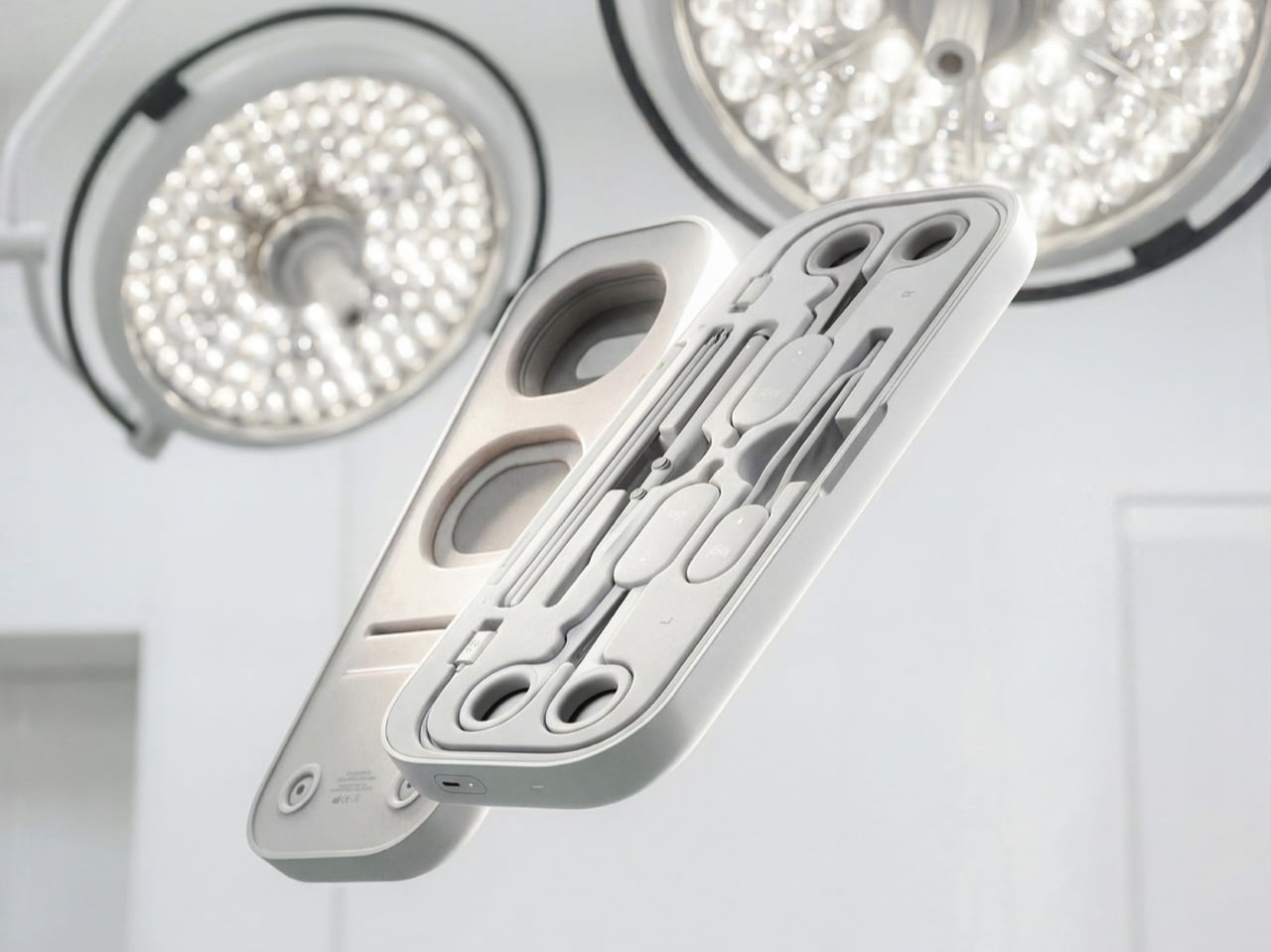
Niklas Andreasen, with Logitech, split a surgical tray into three hand-feel families: ring-handled scissors and clamps, forceps, and pen-grip tools. Each MX Surgical controller covers one family and changes spring tension and travel, so the same body can feel like a fine scissor or a stiff clamp. Layered pads in the case stand in for tissue. A headset draws the anatomy and reveals deeper layers as you cut. The log scores precision, force and timing. It is a concept, already nominated for Red Dot's Peter Zec Prize.
니클라스 안드레아센은 로지텍과 함께 수술 트레이를 세 가지 손맛으로 나눴다. 링 손잡이의 가위와 클램프, 포셉, 펜 그립 도구다. MX 서지컬 컨트롤러는 가족마다 하나씩이고, 스프링 장력과 움직임을 바꿔 같은 몸체가 가는 가위이거나 뻑뻑한 클램프처럼 느껴지게 한다. 케이스의 층진 패드가 조직을 대신한다. 헤드셋이 해부를 그리고, 자를수록 더 깊은 층을 연다. 기록은 정밀도, 힘, 타이밍을 점수로 남긴다. 콘셉트이고, 레드닷 페터 체크 상에 후보로 올랐다.
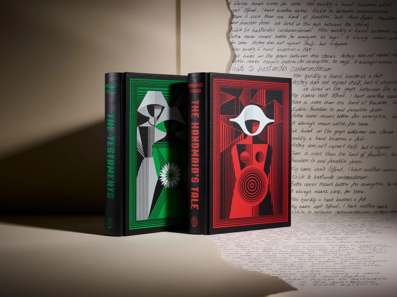
Anna and Elena Balbusso returned to Margaret Atwood for a Folio Society box of The Handmaid's Tale and The Testaments, 750 signed copies. The 2012 plates stay, plus a ninth: the Eyes coming for Offred. The Testaments plates add a hand out of a dentist's chair and a sky of eyes. They swapped Atwood's Georgian architecture for Constructivist angles. The red wall was their invention in 2012, and the television series kept it. The first book is white, black, grey and red. The sequel adds green, grey and pink.
안나와 엘레나 발부소는 마거릿 애트우드로 돌아왔다. 폴리오 소사이어티의 《시녀 이야기》 상자, 750부, 서명본이다. 2012년 도판이 남고, 아홉 번째가 더해진다. 눈이 오프레드를 데리러 온다. 《증언》에는 치과 의자에서 나온 손과 눈으로 찬 하늘이 있다. 그들은 애트우드의 조지언 건축을 구성주의의 각으로 바꿨다. 붉은 벽은 2012년 그들의 발명이고, 드라마가 그것을 남겼다. 첫 책은 흰색, 검정, 회색, 빨강이고, 속편은 초록, 회색, 분홍을 더한다.
Theresa Schlag's Substance 3D Designer file holds four hand-painted bases: a two-colour gradient, a gradient mask, spots and flakes. The gradient reads baked world normals through a Light node, and the angles are custom floats. She likes 80 degrees in the viewport, which is 0.22 turns. The mask stayed blocky until the RGBA Split output went to 16 bits per channel, with a light Blur HQ before the histogram scan. Spots and flakes then pass through slope blur, so the breakup still looks painted.
Theresa Schlag的Substance 3D Designer文件里有四套手绘底:双色渐变、渐变遮罩、斑点和碎片。渐变用Light节点读烘焙的世界法线,角度做成自定义浮点,因为节点自己的圈数预览不对。她喜欢视口里的80度,也就是0.22圈。遮罩一直发块,直到RGBA Split的输出改成每通道16位。斑点和碎片接着过坡度模糊,破碎看起来仍像画出来的。
테레사 슐라크의 섭스턴스 3D 디자이너 파일에는 손그림 베이스가 네 개 있다. 두 색 그라데이션, 그라데이션 마스크, 스폿, 플레이크다. 그라데이션은 라이트 노드로 구운 월드 노멀을 읽고, 각도는 커스텀 플로트다. 뷰포트의 80도는 0.22턴이다. 마스크는 RGBA 스플릿 출력을 채널당 16비트로 올리기 전까지 각졌다. 스폿과 플레이크는 슬로프 블러를 지나, 깨짐이 아직 칠한 것처럼 보인다.
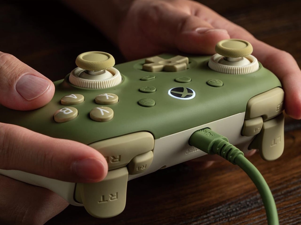
8BitDo's Ultimate 3C+ Wired for Xbox is $39.99, USB-C, no battery, a 2.5-metre cable and a 3.5 mm jack. The sticks are TMR, with tension you tighten for a shooter or loosen for a racing sweep, and a silicone ring at the end of travel. A switch on the triggers chooses a long Hall-effect pull or a short micro-switch click. R4 and L4 remap without software. Two back buttons lock so a palm does not fire a reload. The body is 151.5 mm and 224 grams. Matcha Green and Charcoal Gray ship on 16 November.
에잇비트두의 얼티밋 3C+ 유선 엑스박스판은 39.99달러다. USB-C이고 배터리가 없으며, 케이블 2.5미터, 단자 3.5밀리미터. 스틱은 TMR이고, 장력은 슈팅에 조이거나 레이싱에 푼다. 트리거 스위치는 긴 홀 효과 당김과 짧은 마이크로스위치 클릭 중 고른다. R4와 L4는 소프트웨어 없이 다시 매긴다. 뒤 버튼은 잠가서 손바닥이 재장전을 누르지 않게 한다. 151.5밀리미터, 224그램. 말차 그린과 차콜 그레이는 11월 16일 출고다.
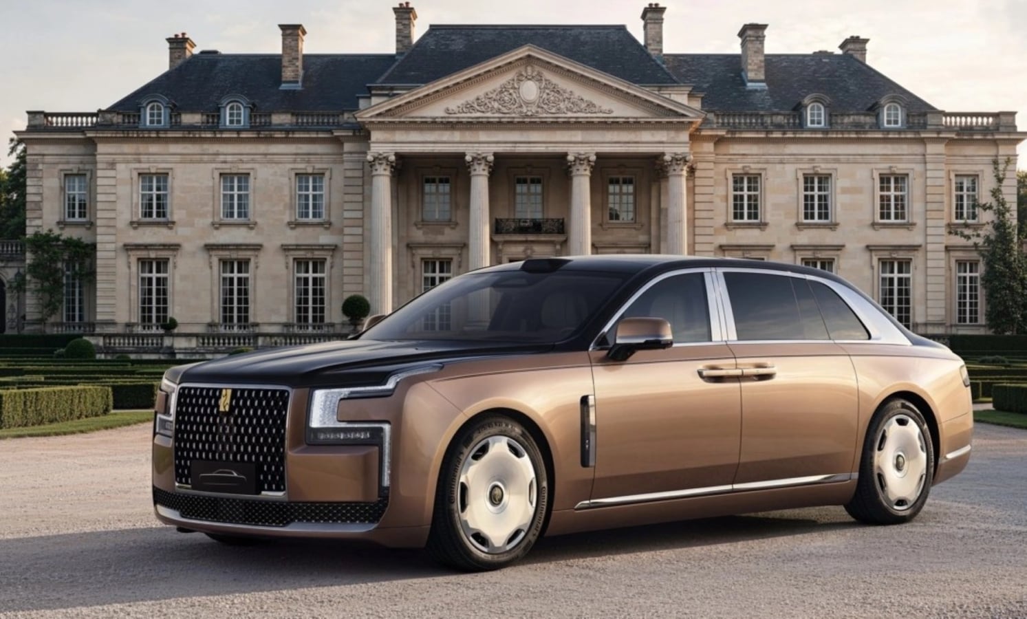
On the Yangwang Altior the front of the cabin is one panoramic screen, and the controls in front of it are crystal rotaries cut with 60 facets. Rear passengers get a 21.4-inch display that folds down from the ceiling, and a table that folds out of the centre island. The front passenger seat drops flat. Coach doors open 80 degrees in front and 90 at the rear. The part worth keeping is the cut-crystal knobs, and the screen that only exists when someone in the back asks for it.
양왕 알티오르의 앞좌석 캐빈은 파노라마 화면 하나이고, 그 앞의 조작은 60면으로 깎은 크리스털 로터리다. 뒷좌석은 천장에서 접혀 내려오는 21.4인치 화면과, 센터 아일랜드에서 나오는 테이블을 갖는다. 앞 동승석 시트는 평평하게 눕는다. 전장 5,600밀리미터, 휠베이스 3,500밀리미터다. 코치 도어는 앞이 80도, 뒤가 90도다. 남길 부분은 깎은 크리스털 노브와, 뒷사람이 원할 때만 존재하는 화면이다.
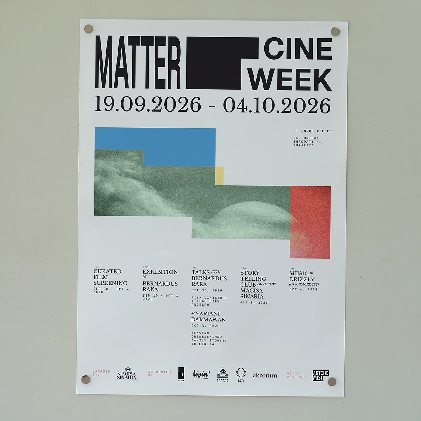
Akronim Design Bureau, directed by Adji Herdanto, built Matter Cine Week '26 from a camcorder's recording grid. One captured pixel is the unit, and it steps across the frame. The word Matter is the logotype, stretched on that same grid until it hits the edge of a ticket, a badge or a poster and still reads. High-contrast colour blocks split the film programmes. The totes are with Denim Works. The festival sits at Unsur, hosted by Magisasinaria.
Akronim Design Bureau由Adji Herdanto指导,用一台摄像机的记录网格做了Matter Cine Week '26。一个被捕获的像素是单位,它一步步走过画面。Matter这个词是标志,在同一张网格上被拉开,直到顶到票、徽章或海报的边缘,字还能读。高对比色块分开不同的放映单元。托特包和Denim Works一起做。影展在Unsur,由Magisasinaria主办。
아크로님 디자인 뷰로는 아지 헤르단토의 디렉션으로, 캠코더의 녹화 그리드에서 매터 시네 위크 '26을 만들었다. 캡처된 픽셀 하나가 단위이고, 프레임을 가로질러 한 칸씩 나아간다. 매터라는 단어가 로고타입이고, 같은 그리드 위에서 늘어나 티켓과 배지와 포스터의 가장자리에 닿아도 읽힌다. 높은 대비의 색 블록이 상영 프로그램을 나눈다. 토트는 데님 웍스와 했다. 축제는 마기사시나리아가 연 우르수르에 있다.
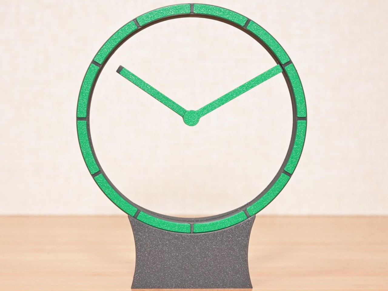
Shinsaku Hiura's Hollow Clock V leaves the dial empty. The minute hand rides a ring hidden in a border about 0.28 inches wide. The hour hand pivots at the centre and is aimed by three neodymium magnets in a T: two on a second ring, one in the hand, so nothing has to cross the opening. A stepper motor, a worm and bevel gears turn the minute ring 12 times for each turn of the hour ring. To set the time you lift the ring off the gears, move the hands, and drop it back. USB-C leaves at the rear.
히우라 신사쿠의 할로우 클록 V는 다이얼을 비워 둔다. 분침은 너비 약 0.28인치의 테두리에 숨은 링을 탄다. 시침은 중심에서 돌고, T자로 놓인 네오디뮴 자석 세 개가 방향을 잡는다. 두 개는 둘째 링에, 하나는 침 안에 있어서 개구부를 가로지르는 부품이 없다. 스테퍼 모터와 웜, 베벨 기어가 분침 링을 시침 링의 한 바퀴마다 12번 돌린다. 시각을 맞출 때는 링을 기어에서 들어 올리고, 침을 옮긴 뒤 다시 넣는다. USB-C는 뒤로 나간다.